Branding a web platform that enables digital identity verification

Brief
To craft a unique and youthful identity for a web application created by cloud telecom giant Exotel. The new platform, Exoverify, enables verification of digital accounts through API.
Branding and Identity Design
Corporate
Creating a zestful brand identity
With a new-age digital audience in mind, Exoverify needed to be positioned as modern, approachable and technologically forward. While Exoverify may be a digital company, its branding needed to be human-centric, to reflect the brand’s ethos of bridging the gap between real and digital life. We also wanted to retain visual elements to connect it to Exotel, its parent company.
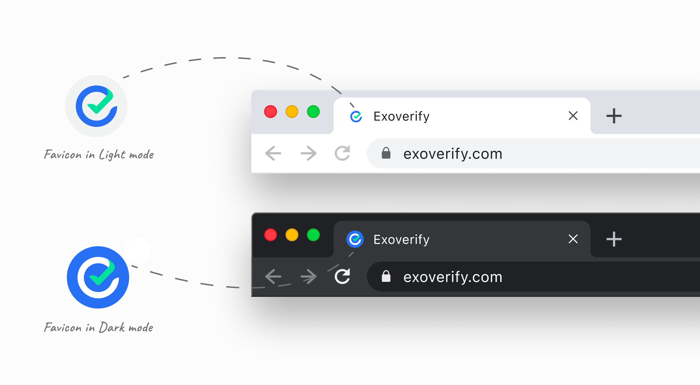
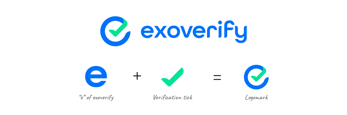
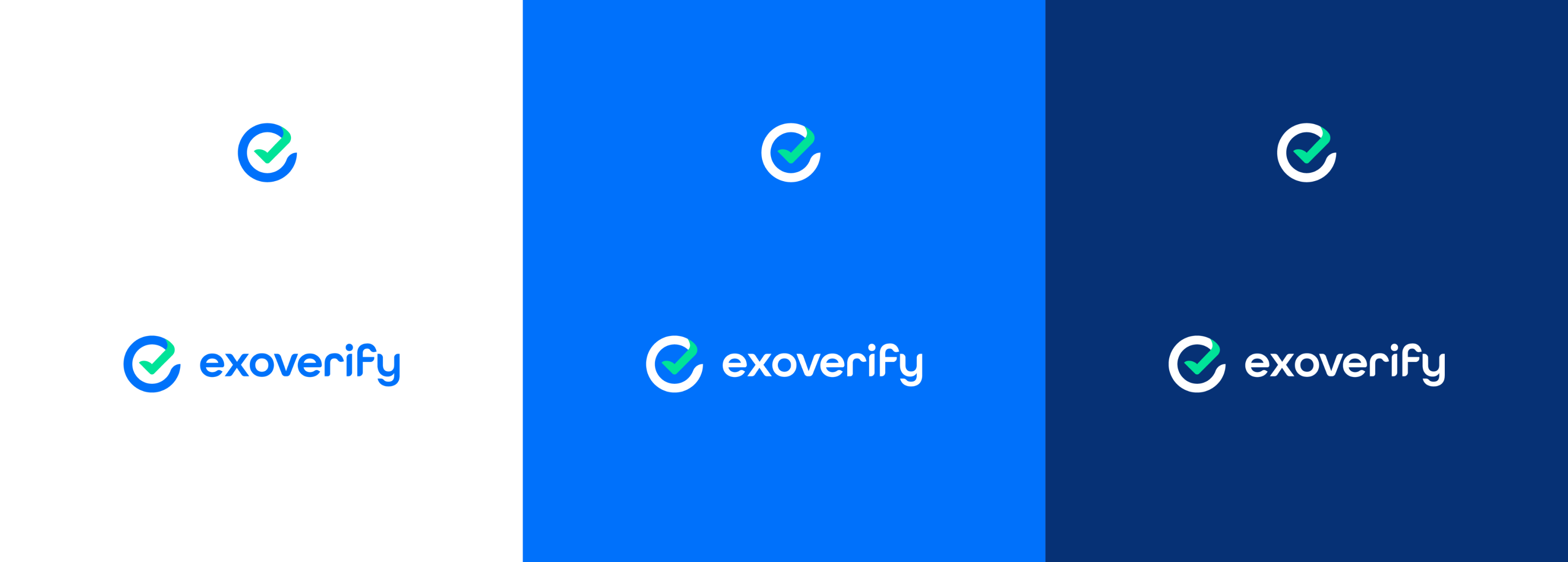
A logo that works even as an insignia
We created a functional, easy to identify logo with two distinct visual elements - the ‘e’ and a tick mark. The ‘e’ comes from the name and the tick symbolises that an identity has been correctly verified, i.e. the platform’s expertise in authentication and security.
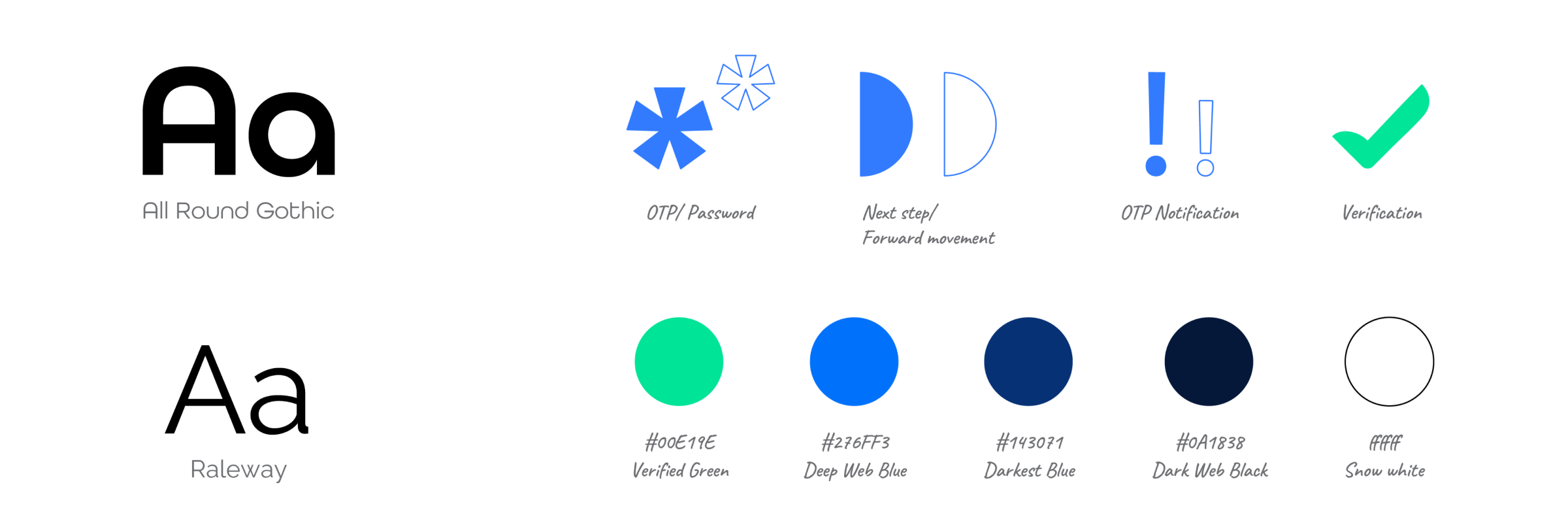
The selection of the font was a major design cue. A lowercase geometric sans-serif typeface gives a modern yet softer, easy-going appeal that ties in with the human-centric approach for the overall design.
Brand Personality - The New Face of Digital Security
Exoverify has been modelled on an expert’s personality, one that is knowledgeable, trustworthy, savvy and empathetic towards their customer. As a friendly and helpful expert in the digital technology industry, Exoverify must stand out as a reliable, reputed player with experience, spunk and conviction.
Brand Voice - The Voice of a New Digital Landscape
Approachable | Supportive | Confident
Exoverify’s brand voice is straightforward, honest and understanding. It is supportive of its customers, helpful and approachable.

Visual Language
A Symbolic Visual Identity
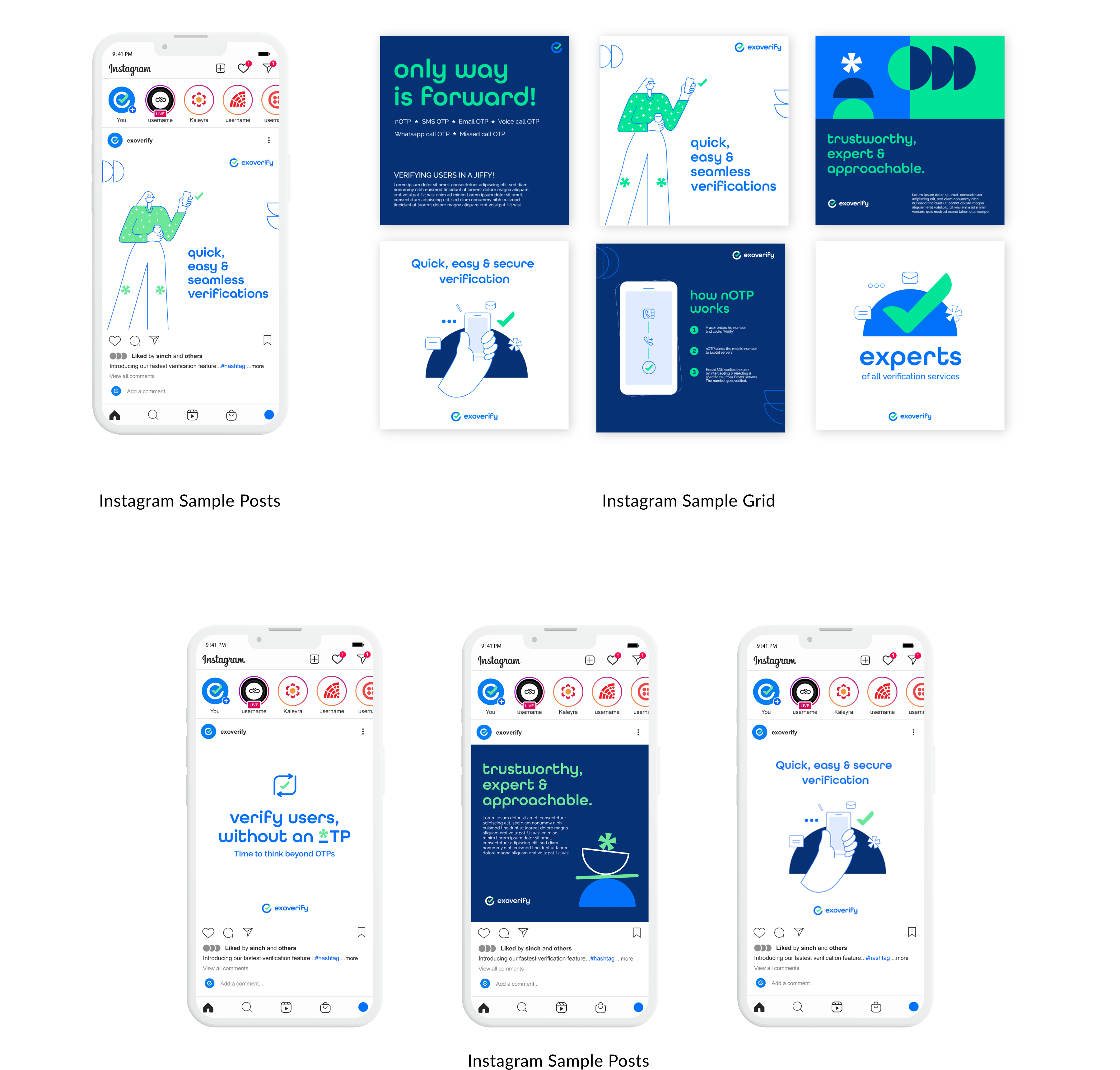
To represent Exoverify’s expertise in digital security, we adopted the most easily recognisable symbols related to the steps of verification:
- the tick mark, to denote that an identity has been verified;
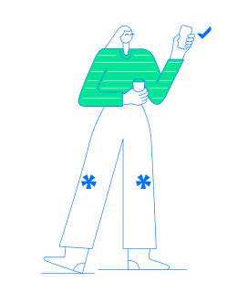
- the asterisk, to symbolise sensitive information, for instance, passwords;
- the exclamation mark, inspired by the notification one gets when we receive an OTP
All these symbols are already registered in users’ minds, especially amongst savvy consumers who are well versed with the digital landscape.
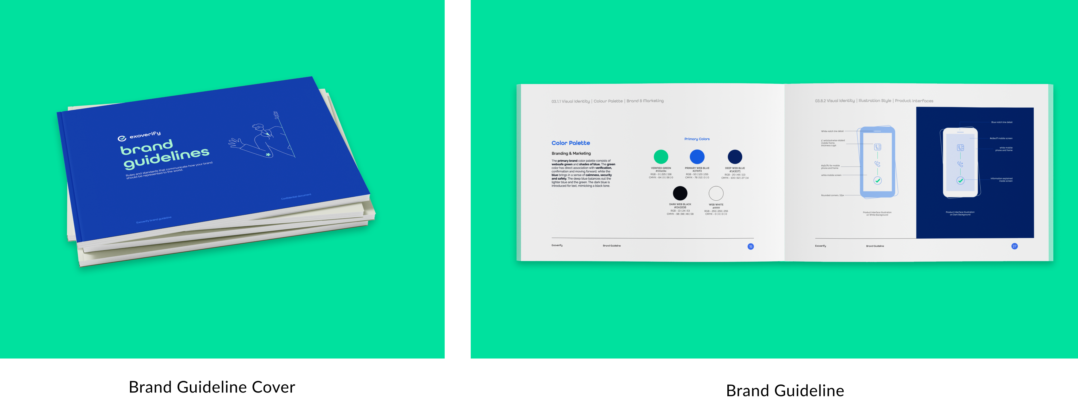
We chose blue and green as brand colours as blue denotes security and is one of Exotel’s primary brand colours, and green implies accuracy of the authentication process as well as lends a fresh youthfulness to the branding.
Overall, our aim was to strike a balance between futuristic technology and human touch, the space Exoverify occupies as an enterprise.
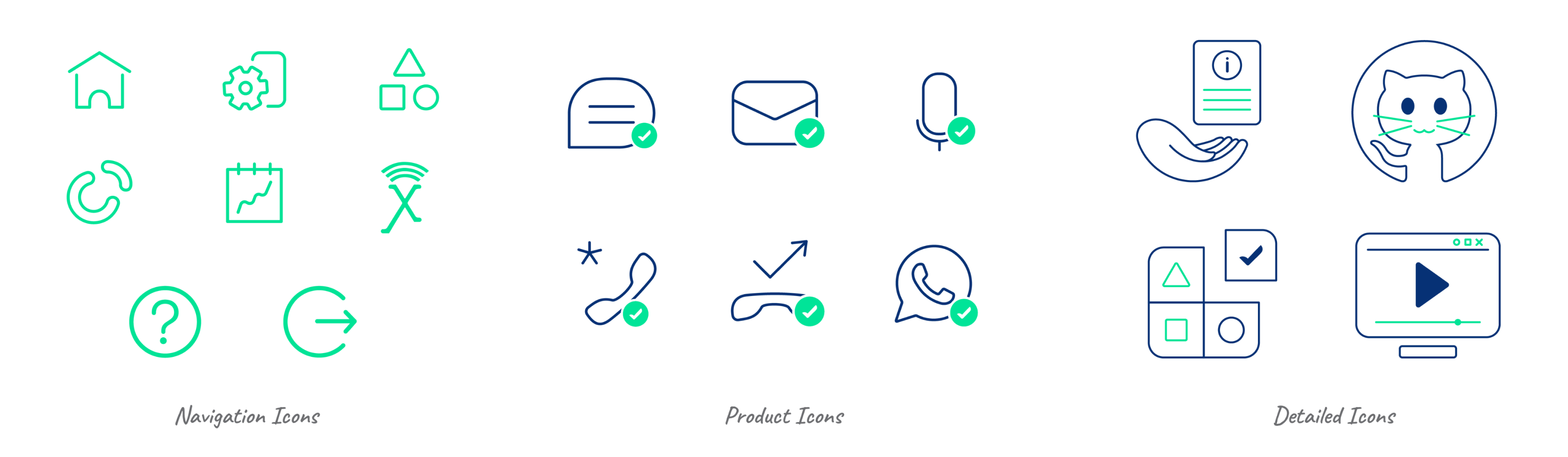
A modern, minimalist illustration style
Speaking to today’s digital audience, Exoverify’s branding incorporates contemporary minimalist illustrations with rounded geometric elements in vector that will appeal to its consumers. Quirky, eye catching compositions with outlined elements and symbols on a solid coloured background further highlight its approachable and affable personality. The usage of exaggerated proportions and rounded corners on lines give it a unique visual branding that will stick around in consumers’ minds.
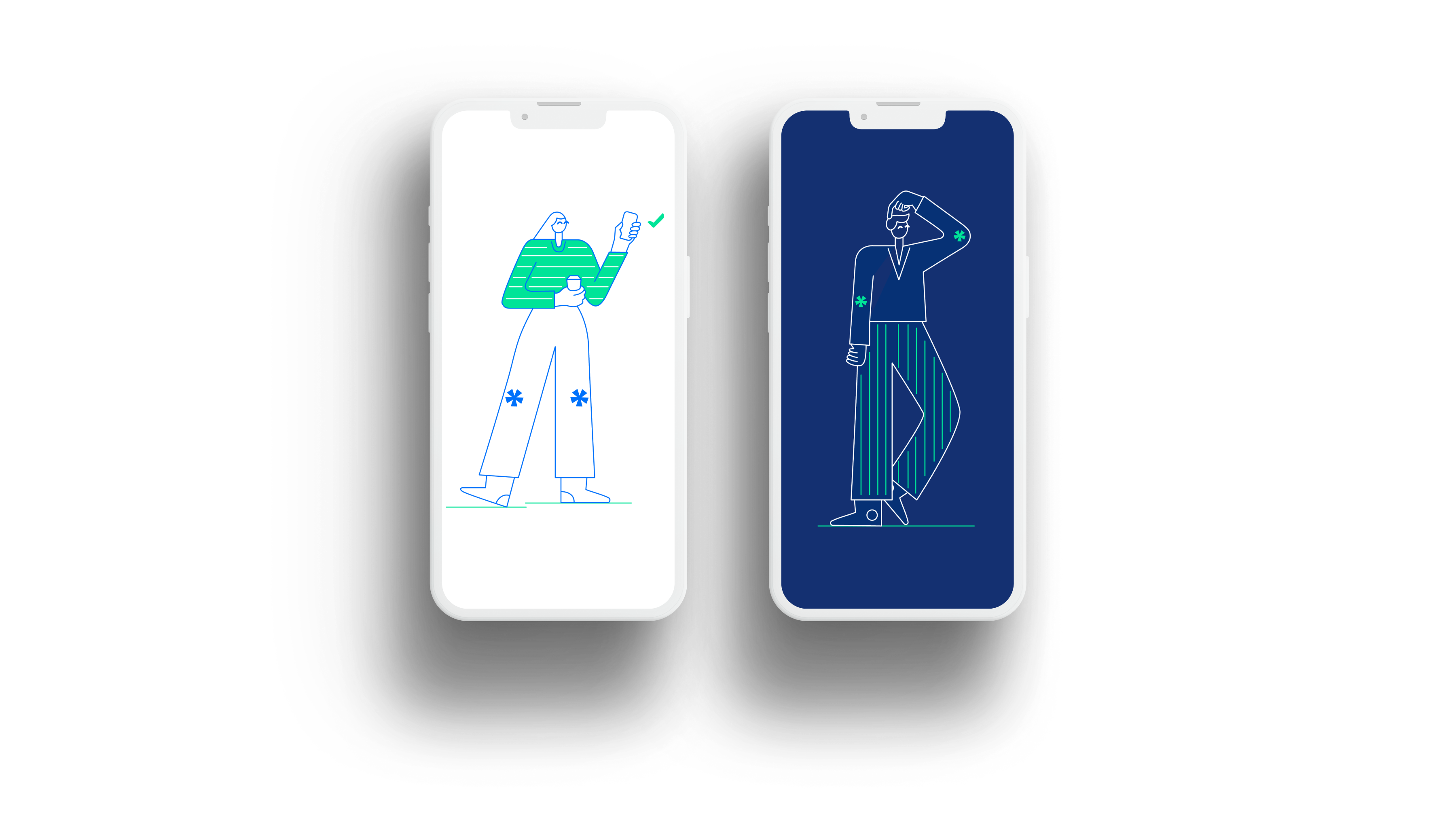

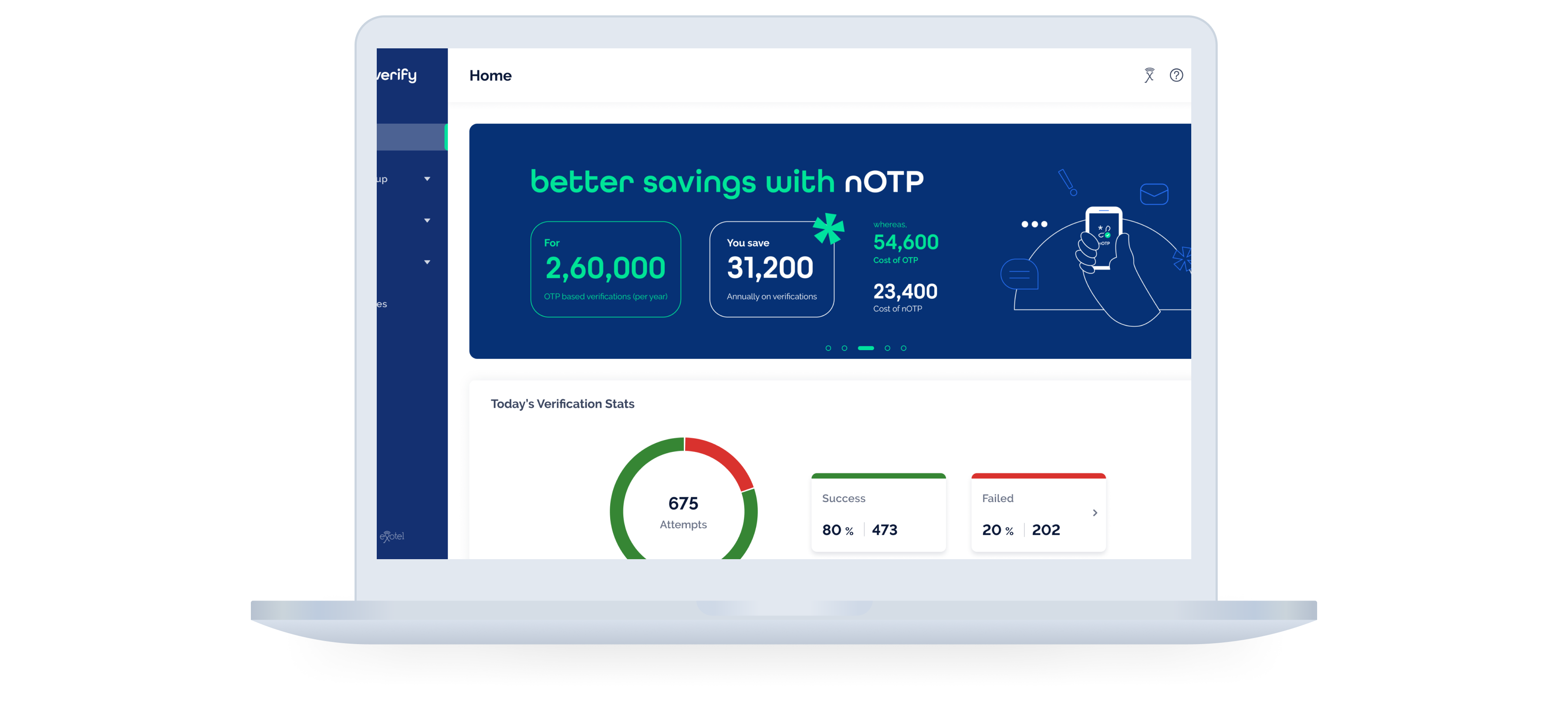
Collaterals and more
Bridging the gap between modern and unconventional, Exoverify’s visual language has a fresh and playful yet gentle, minimalist appeal. Soothing colours and the well-thought ratio of brand colours to white background allow illustrations to shine and give the brand a savvy and uncluttered look.