Elevating BlueJeans’ Virtual Meeting & Web Account Experience
Brief
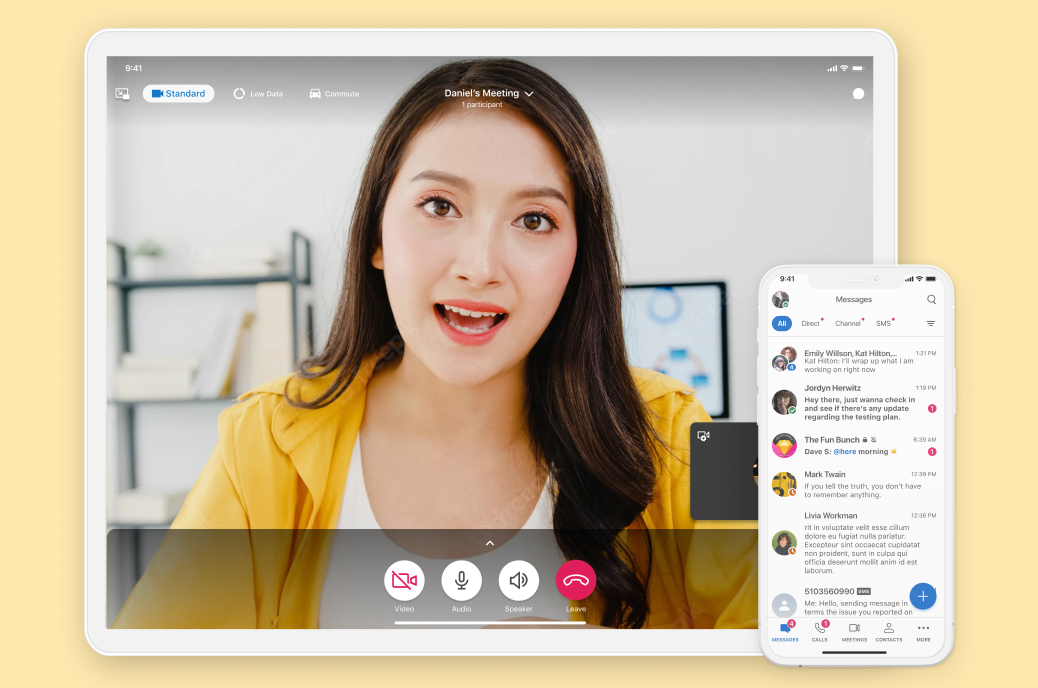
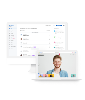
BlueJeans by Verizon is a cloud-based video meetings platform that connects users across different devices, platforms, and conference programs. It has an extended product portfolio that includes Events, Conferences, Televisits, Collab Boards etc.
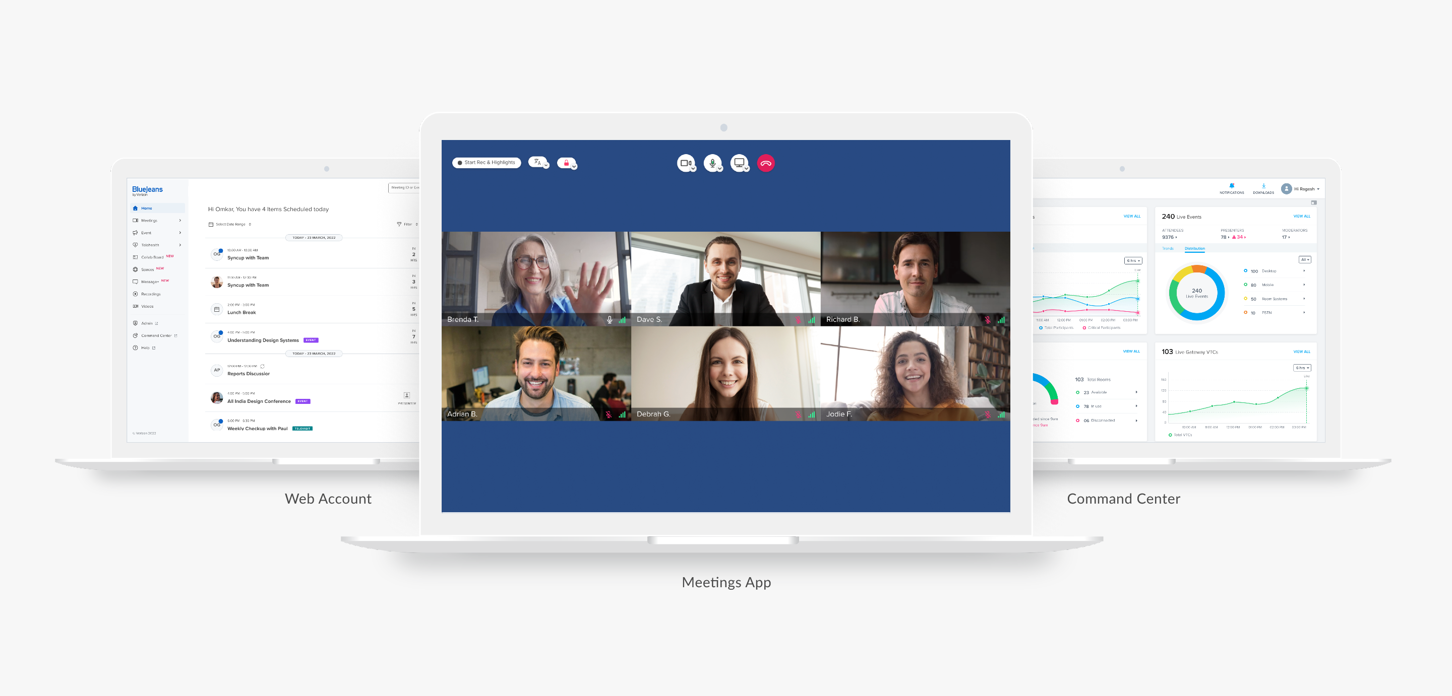
We've redesigned their Web Account, Admin Portal, and Command Centre. The Web Account serves as a hub for users to schedule various types of meetings and efficiently configure their settings. The Admin Portal acts as a centralised hub for admins to manage all products, their settings, and enterprise users. Also, the Command Centre empowers admins by providing comprehensive product analytics and insights.
User Research
Product Strategy
User Experience Design
User Interface Design
Telecommunications
Research & Discovery
In the process of revamping, we engaged in detailed discussions with users. We looked closely at what BlueJeans’ competitors are doing. Additionally, we conducted a comprehensive heuristic evaluation to identify the issues.
We chatted with users online to figure out what bugs them when they use the account and admin portal. Plus, we had a talk with BlueJeans' support folks to learn about the common queries they handle all the time.

We checked out competitors of BlueJeans in the video conferencing domain and drew insights from them to shape our information architecture, user flows, and features. And we also paid attention to their errors, so we don't make the same mistakes.
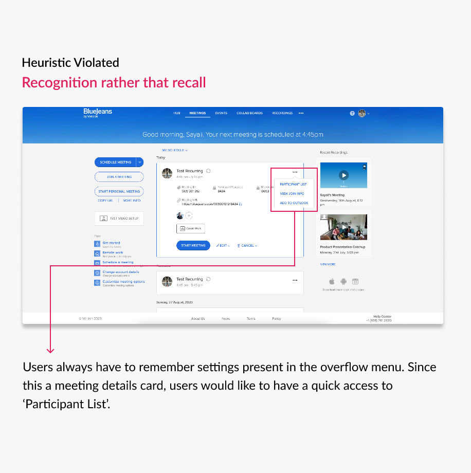
We analysed the complete BlueJeans web account and admin portal against 10 heuristic principles. Our analysis revealed significant concerns related to accessibility, uniformity, and adherence to design standards.
Ideation & Strategy
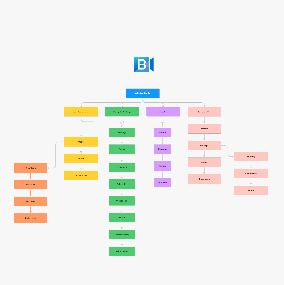
We used our research findings to craft personas and a comprehensive user journey maps. Additionally, the research outcomes played an important role in shaping an entirely new information architecture for the product.
In web account and admin, other products were assigned relatively lower priority compared to meetings. Furthermore, the relative information was scattered throughout the products. We solved these issue by reorganising the entire information architecture for both of them.
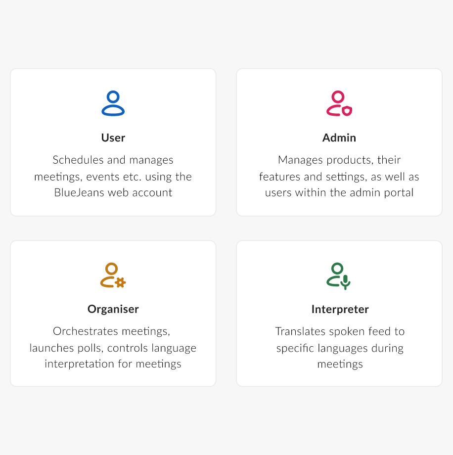
We crafted 4 distinct personas for our product: one representing the everyday user, second the administrative role, third an organiser who orchestrates a meeting, and finally an interpreter. They have been super helpful, leading us smoothly through every step of designing.
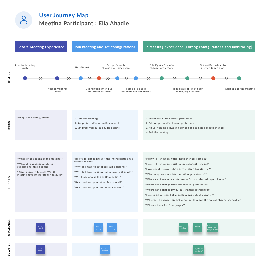
To truly understand how the four personas navigate within the BlueJeans ecosystem and gain valuable insights into their experiences, we meticulously crafted user journey maps tailored to each persona. These maps served as windows into their worlds, revealing not just their actions, but also their emotions, frustrations, and behaviours as they traverse through the product landscape.
A complete transformation of the web account
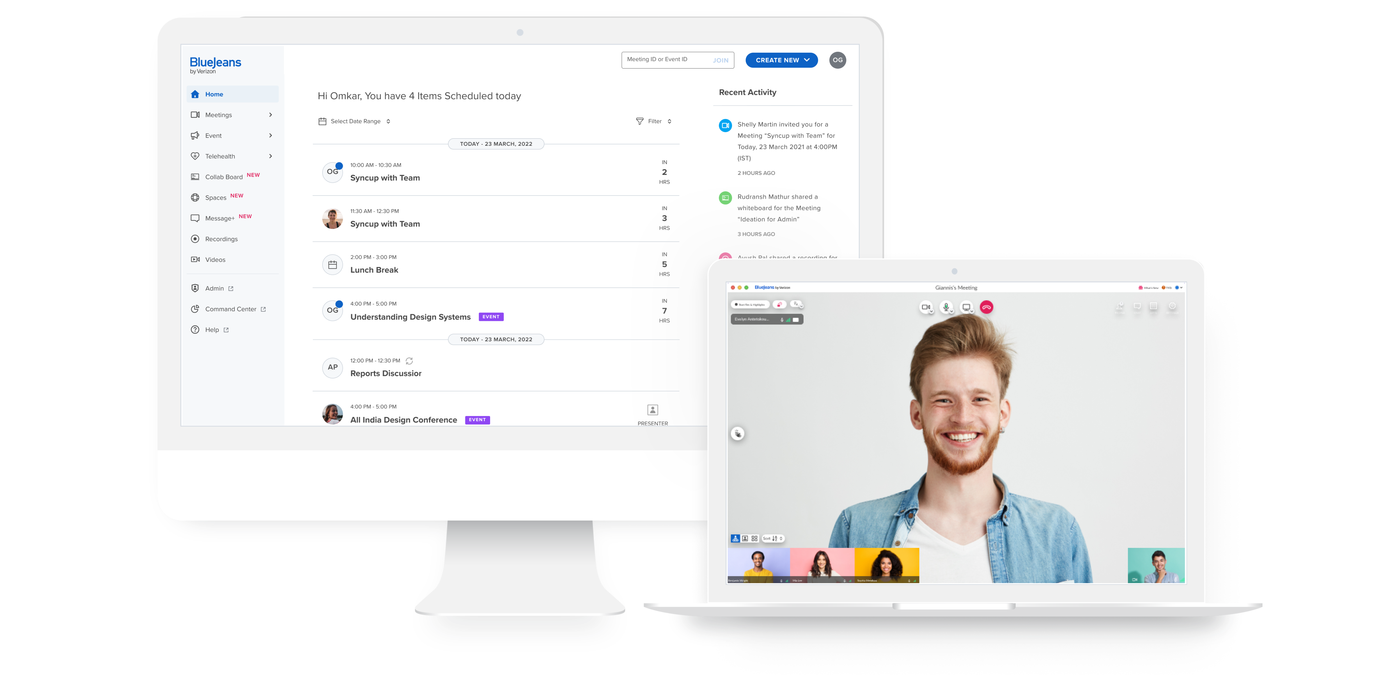
First, we completely revamped the web account's appearance using modern design trends. We changed the navigation from horizontal to vertical, making it easier to use and adaptable. We introduced a new 'Home' concept that shows the user's entire schedule, including meetings, events, and conferences. We also made several other changes based on the issues we identified during our research.
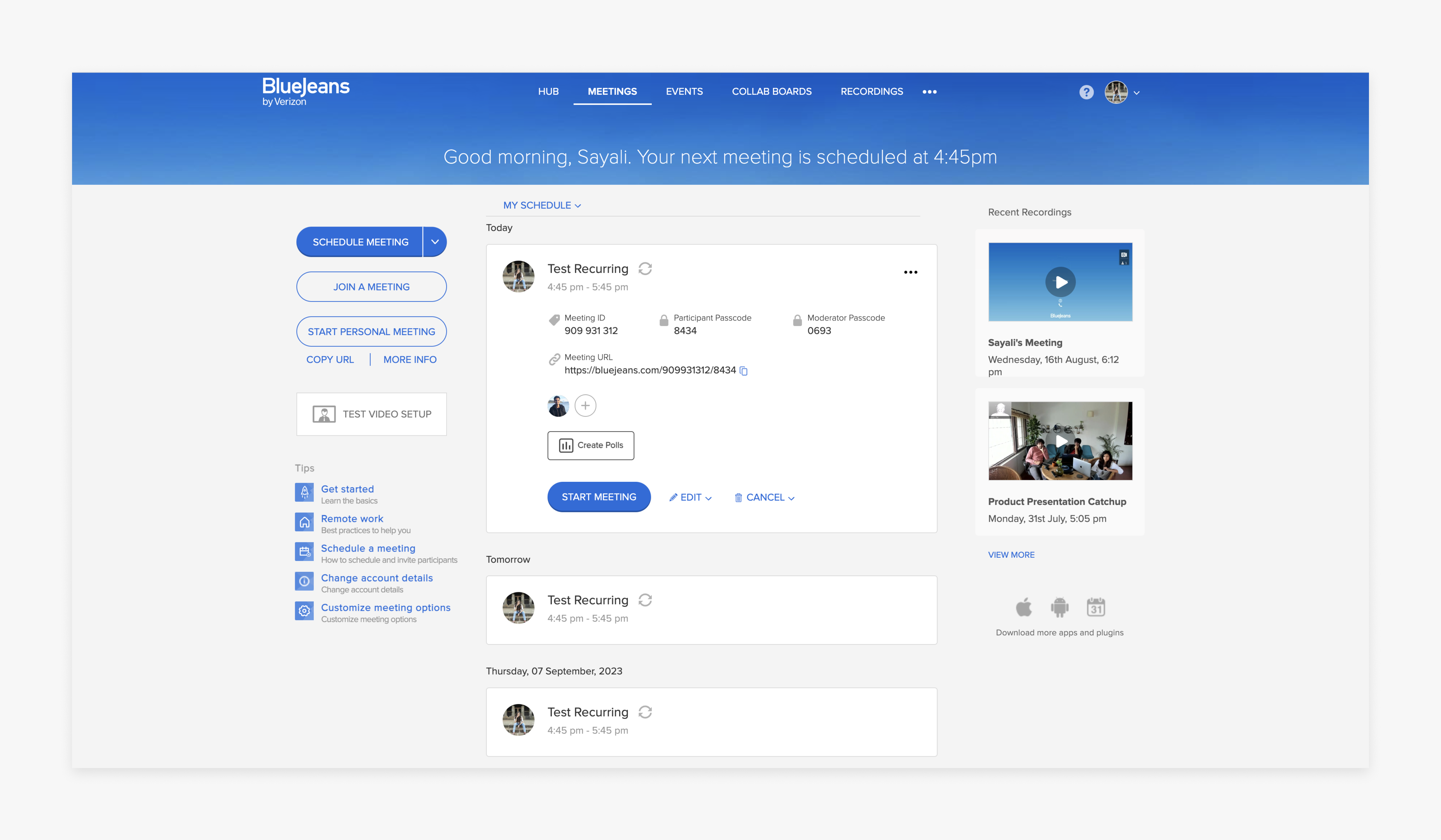
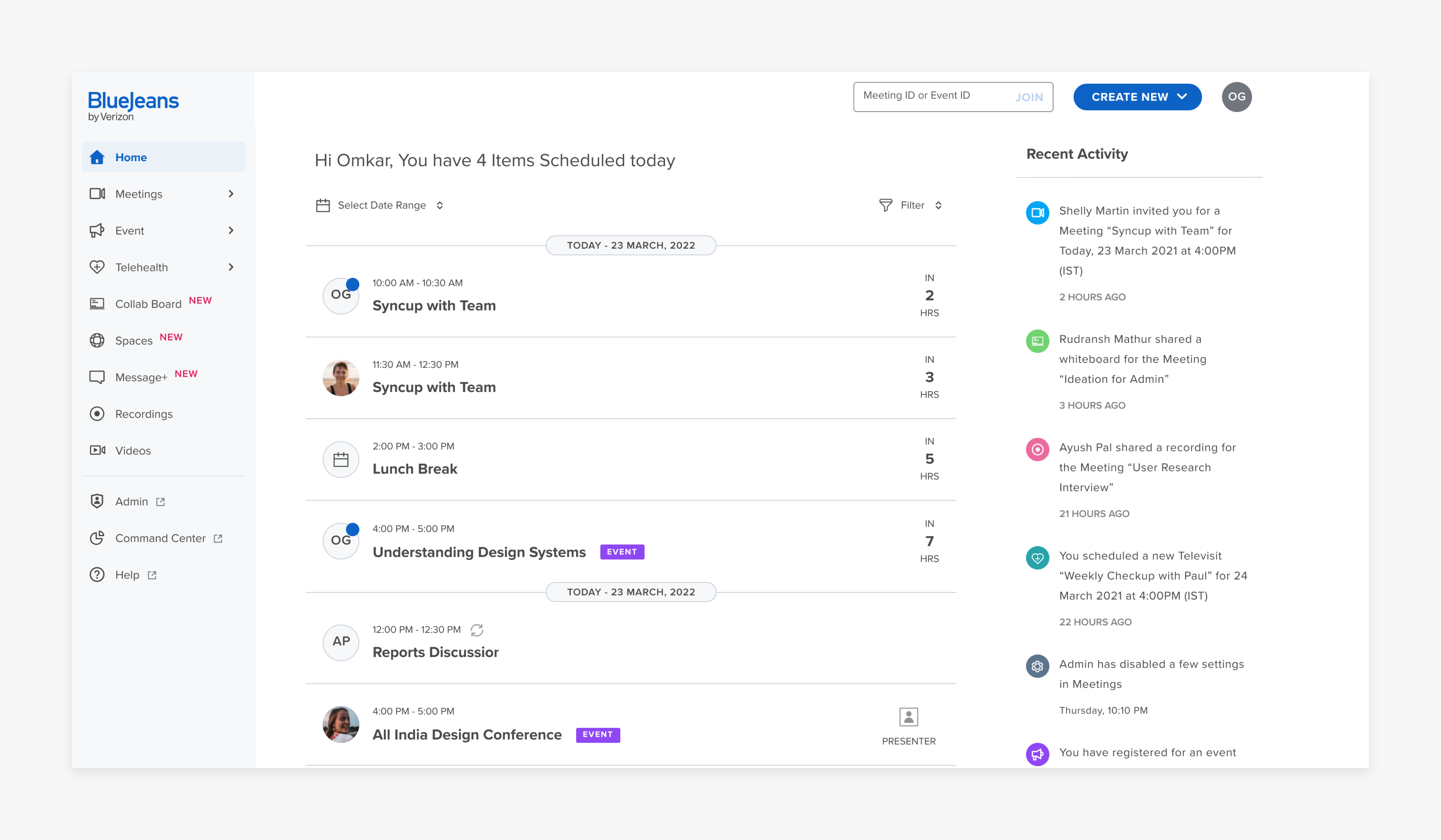
Introducing ‘Home’ to view combined schedule of different virtual meets
Before, users had trouble seeing all their different virtual meets in one place. They had to click through many pages to do it. So, we made things easier by adding a "Home" feature. Now users can quickly check all their virtual meets in one place.
New scheduling experience to create meets with ease
In the past, users had a bit of a struggle dealing with settings and invites in a little pop-up. But we fixed it up by dedicating a whole page for scheduling meetings. So, no more hassle with that cramped pop-up – everything's super smooth now.
Improving productivity pre, during, and post-meetings, with just few clicks
BlueJeans' Smart Meetings feature makes note-taking simple. Our design approach is super smooth – during a meeting, just one click lets you grab important transcripts, tag items, and create summaries to share. Plus, the email we made for smart meeting summaries helps user to quickly catch important decisions, tasks, and other information.
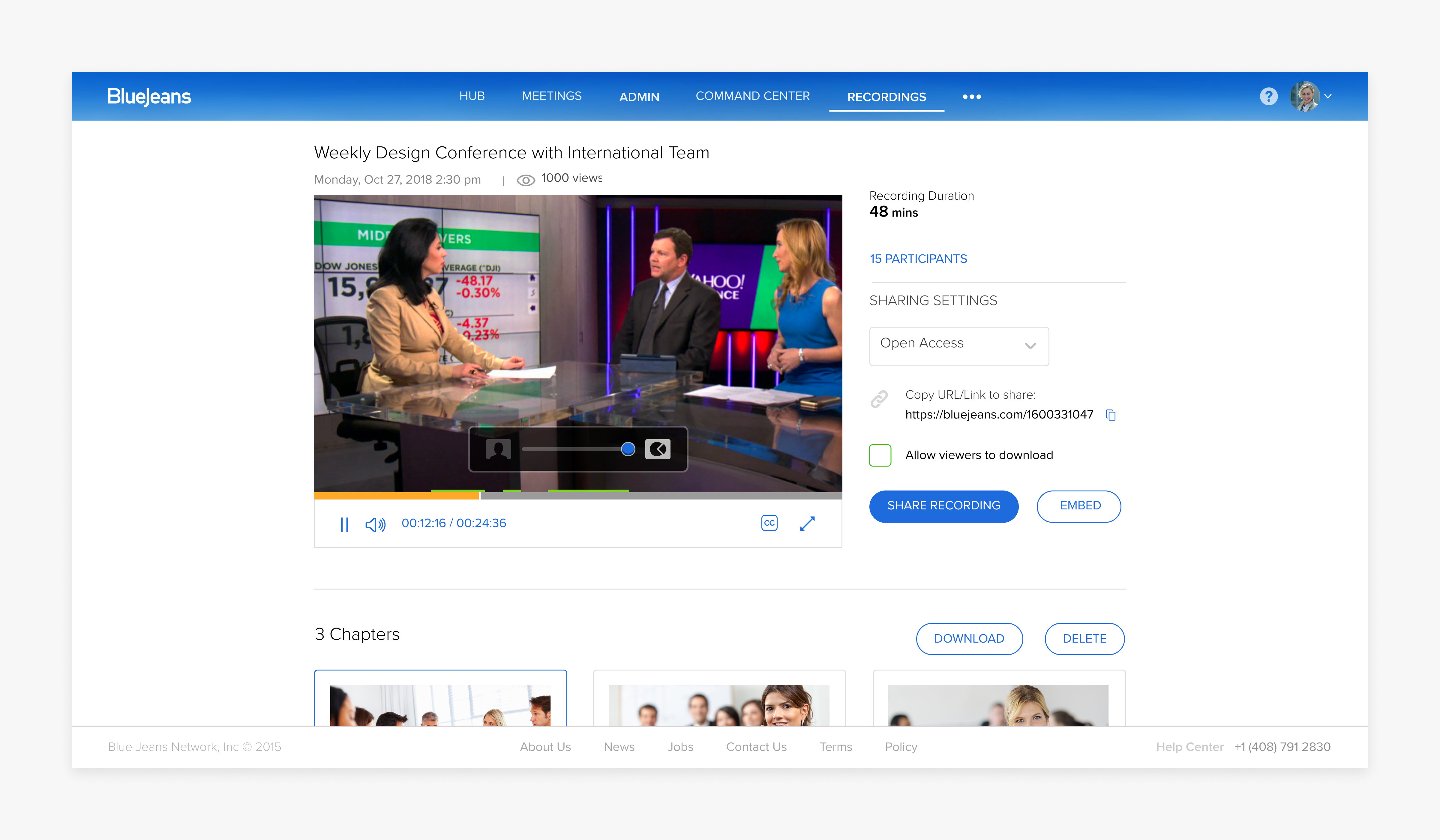
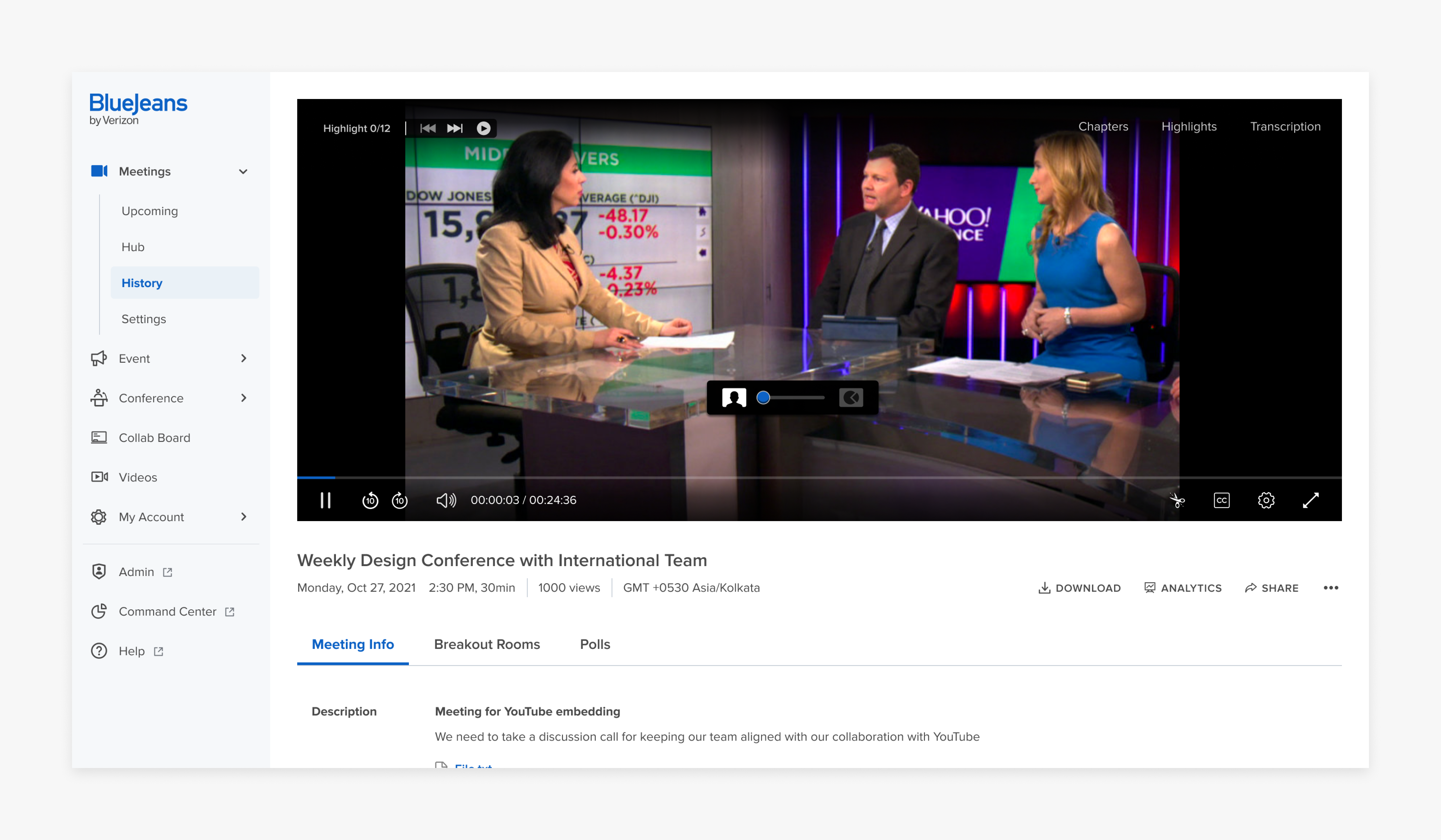
Cleaning up recordings page to improve user’s focus
The recording pages for different products were difficult to use because they weren't the same. And users had to go through different parts to see meetings and recordings, which was a pain. To make things better, we put all the past meeting information with the recordings. This way, everything is in one place. We also made the page look better and easier to understand.
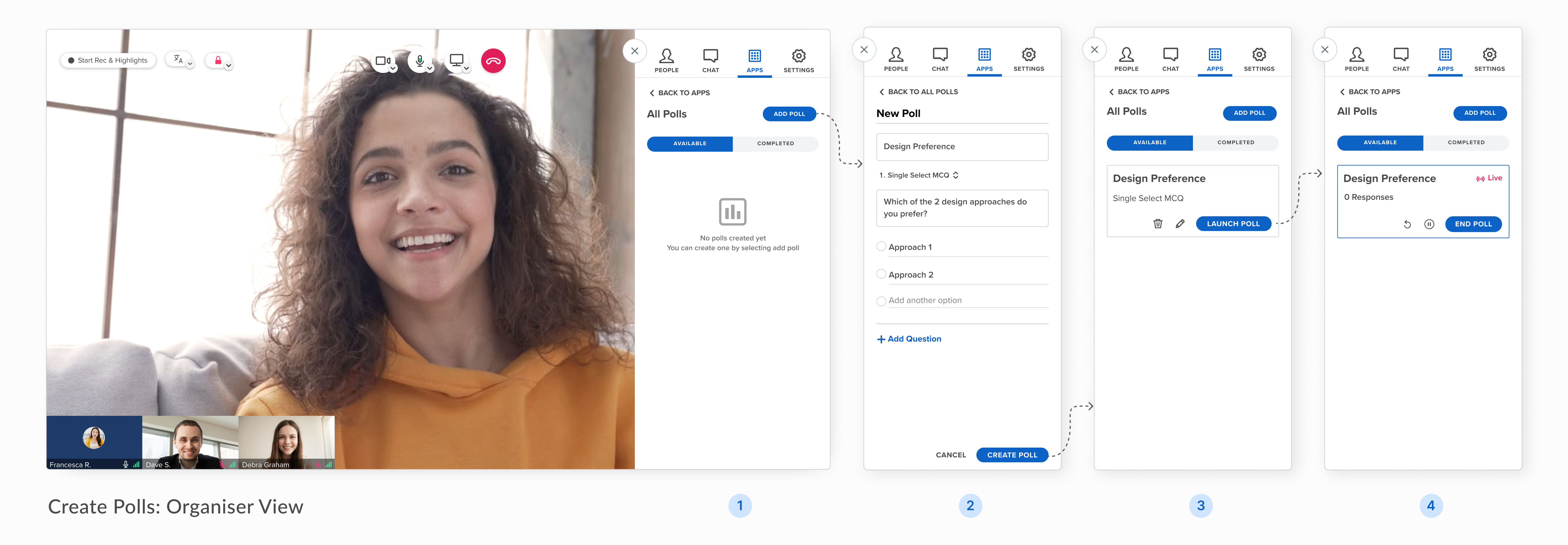
Designing polls for swift setup and easy engaging
We crafted a streamlined experience for polls that can be effortlessly initiated in just four clicks, allowing customisation options tailored to the specific requirements of organisers. Our design empowers users with the flexibility to conduct surveys that precisely align with their objectives.
We enhanced engagement with polls on the participant end as well, making them more noticeable, easier to answer, and providing clear access to response statistics.
Streamlining experience for multilingual support in a live environment
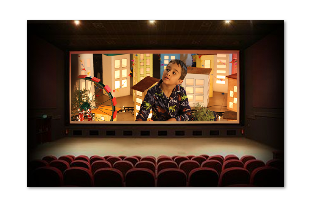
We designed an experience that optimises for translating multiple languages in real-time, making it easy to communicate across language barriers during live events. The streamlining was achieved by optimising the process for each user's needs, removing unnecessary steps that could have prolonged their tasks.
For the organisers, we quickened the process of starting or stopping interpretation through just 1 click, and introduced a view that gives them an overview of all the languages being translated.
We've introduced a streamlined and user-friendly onboarding process for interpreters, featuring upfront language selections. Additionally, a translation panel with intuitive controls has been designed to ensure interpreters have constant insight into the effectiveness of the translation process, allowing for seamless management of volumes and languages.
For participants, we've enhanced their engagement by providing prompt notifications whenever interpretation begins. Additionally, we offer them the convenience of selecting their preferred language for listening to the translation, ensuring they stay seamlessly connected throughout the process.
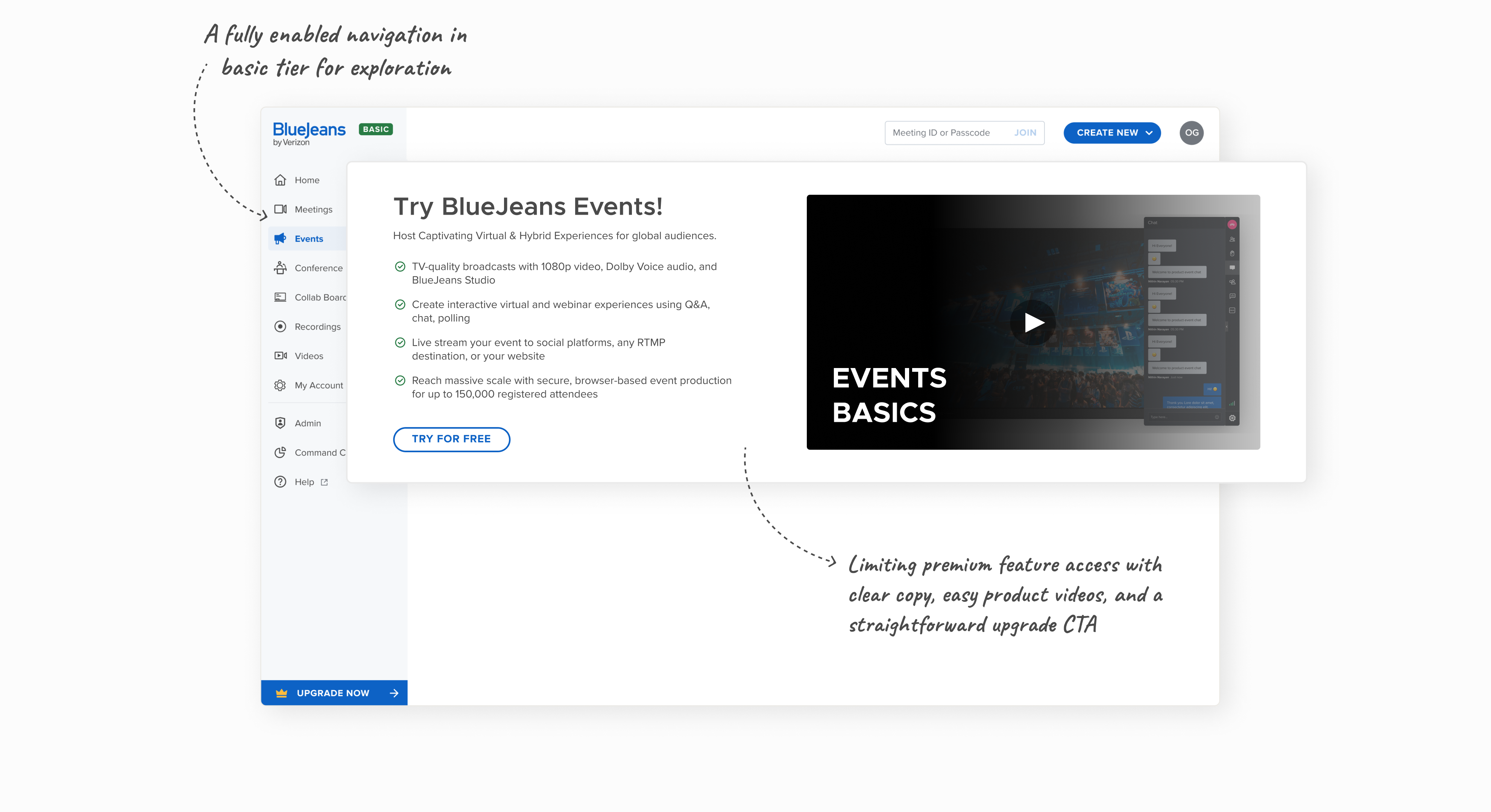
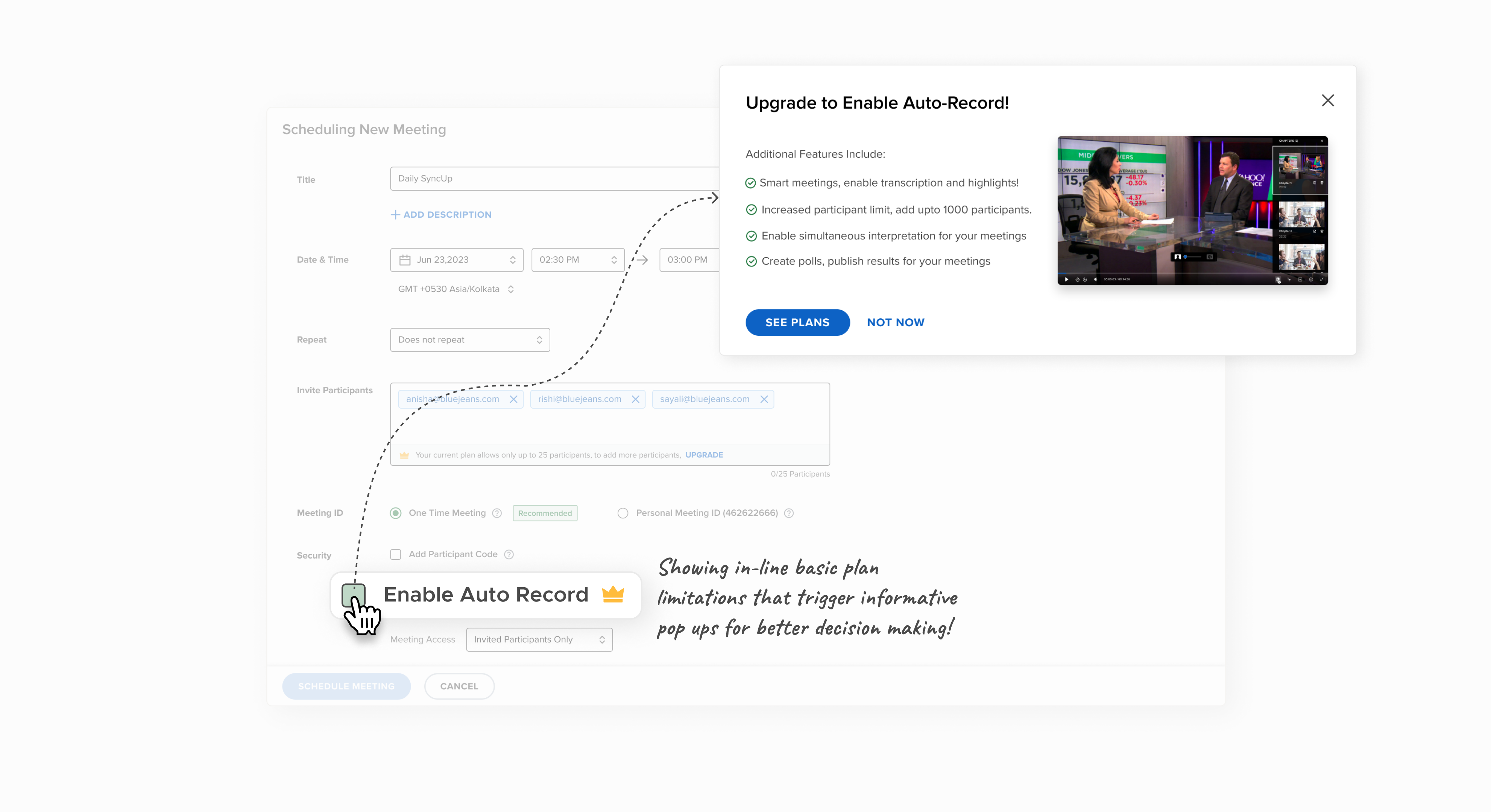
Increasing BlueJeans paid plan adoption through efficient upgrade paths
To encourage BlueJeans' free trial users to upgrade to a paid plan, we provided a range of solutions. We started by making it clear what plan they're on and putting a clear "upgrade" button in the navigation. We also used visual cues to show the premium products and features. This mix of ideas worked well to guide users to upgrade and see the value in better plans.

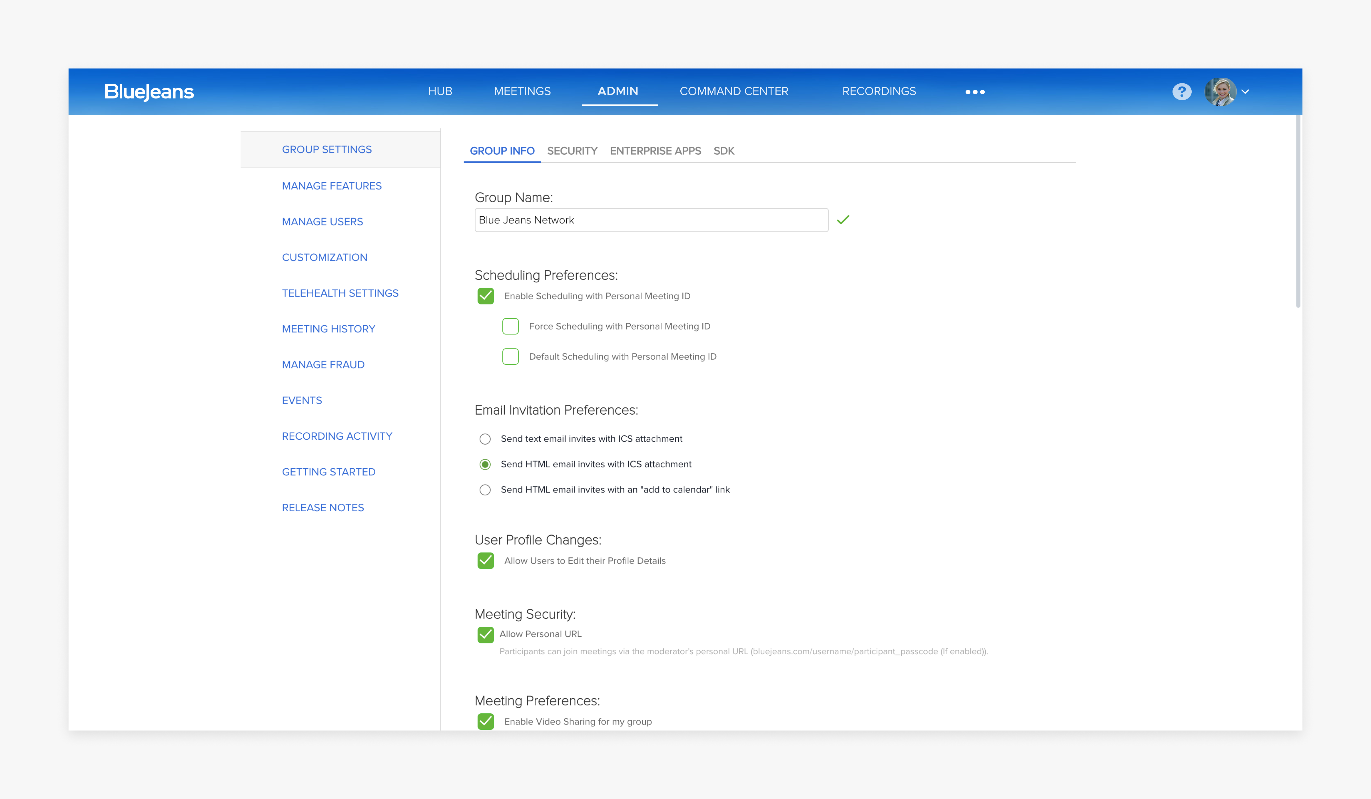
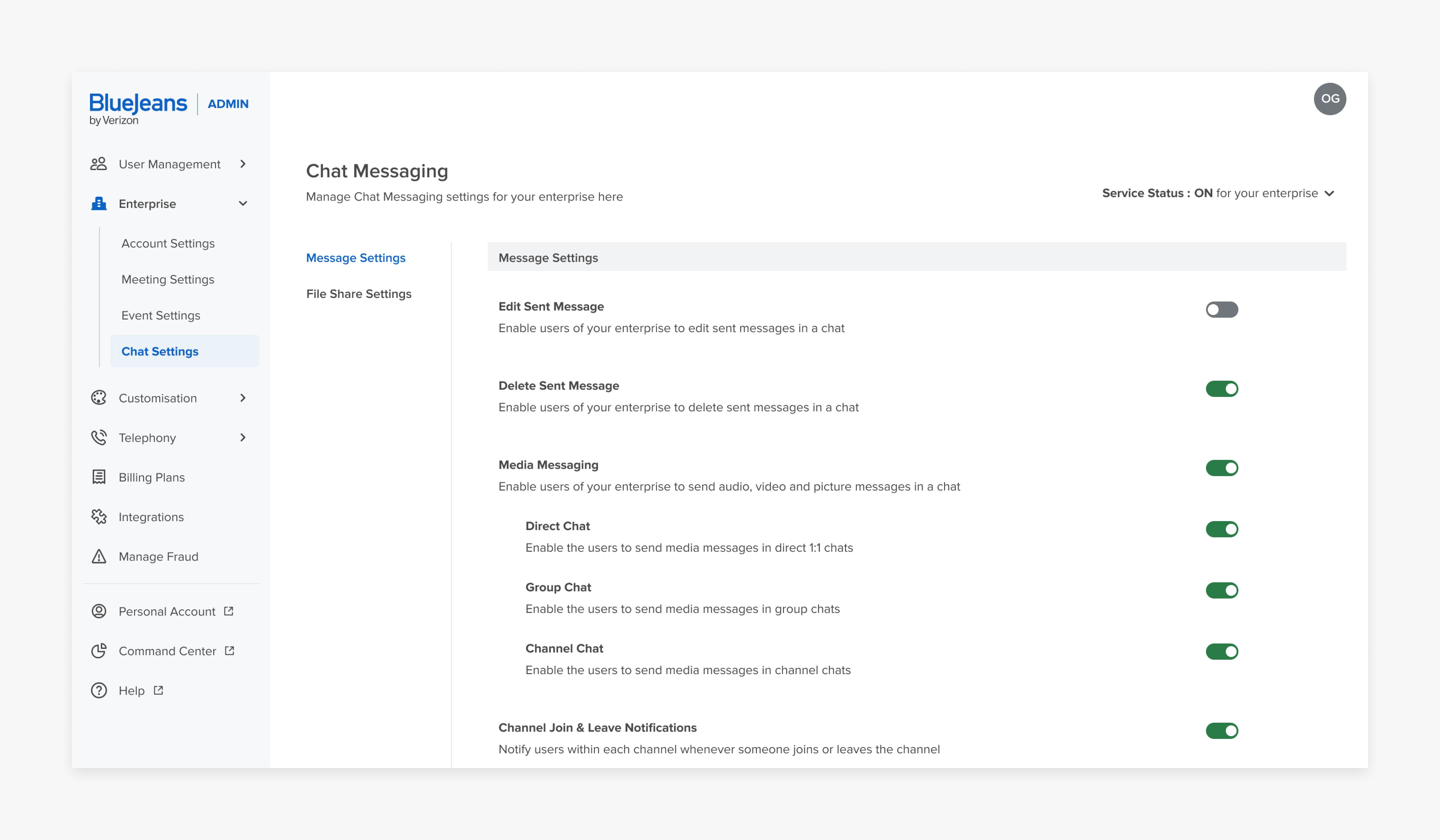
A complete makeover of Admin Portal to manage users and products effortlessly
Similar to the BlueJeans account, the admin portal was primarily centered around 'Meetings,' resulting in less hierarchy for other products and finding specific settings was tricky because things weren't organised well. We changed by primarily changing the navigation and reorganising teh settings.
Streamlining meeting monitoring for IT admins through data visualisation
The BlueJeans Command Centre Analytics was designed to provide a coherent depiction of all data, feedback and ratings. This useful function allows IT admins to monitor usage and easily interpret vast amounts of data. Rich graphical elements were used to provide a more holistic view of the different facets of the product.
Designing for accessibility
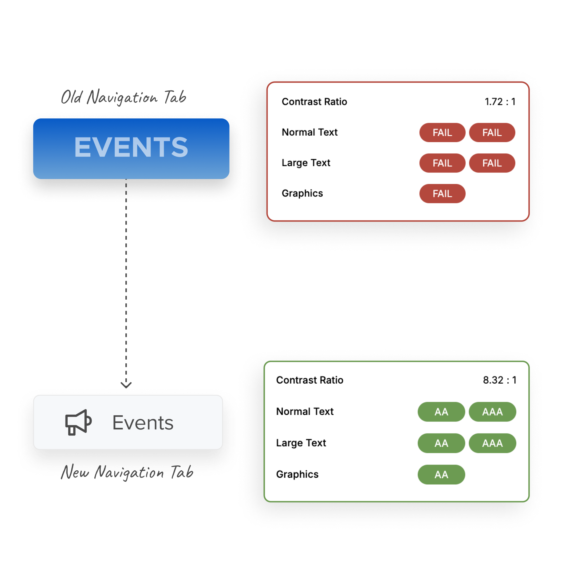
The entire BlueJeans account was designed to meet the WCAG accessibility guidelines.
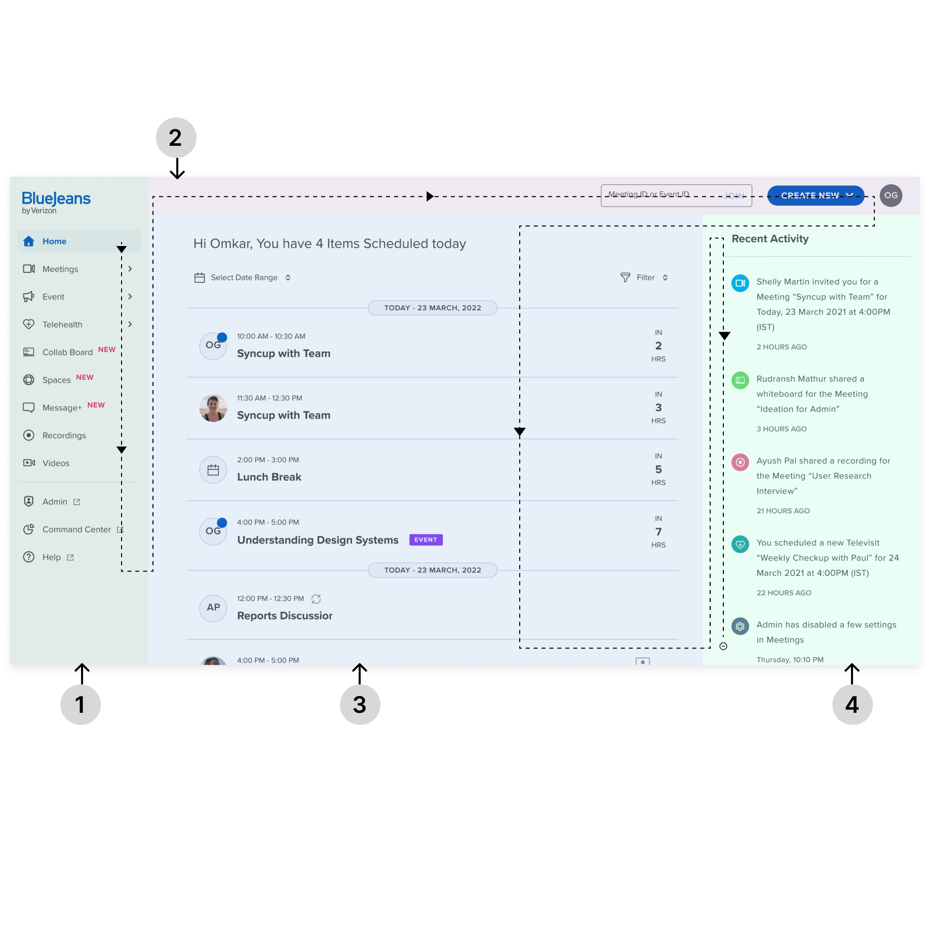
This entailed maintaining the right contrast ratios and sizes, as well as designing a keyboard friendly website. We strategically divided the page into different zones and defined a keyboard tabbing sequence with no shortcuts to jump each section.
With carefully curated color schemes and meticulously chosen fonts, we've transformed the once lackluster design into a visually rich one with a highly accessible experience.
We split the entire layout into easily navigable zones that have a seamlessly designed tabbing sequence that intuitively guides users through their journey.
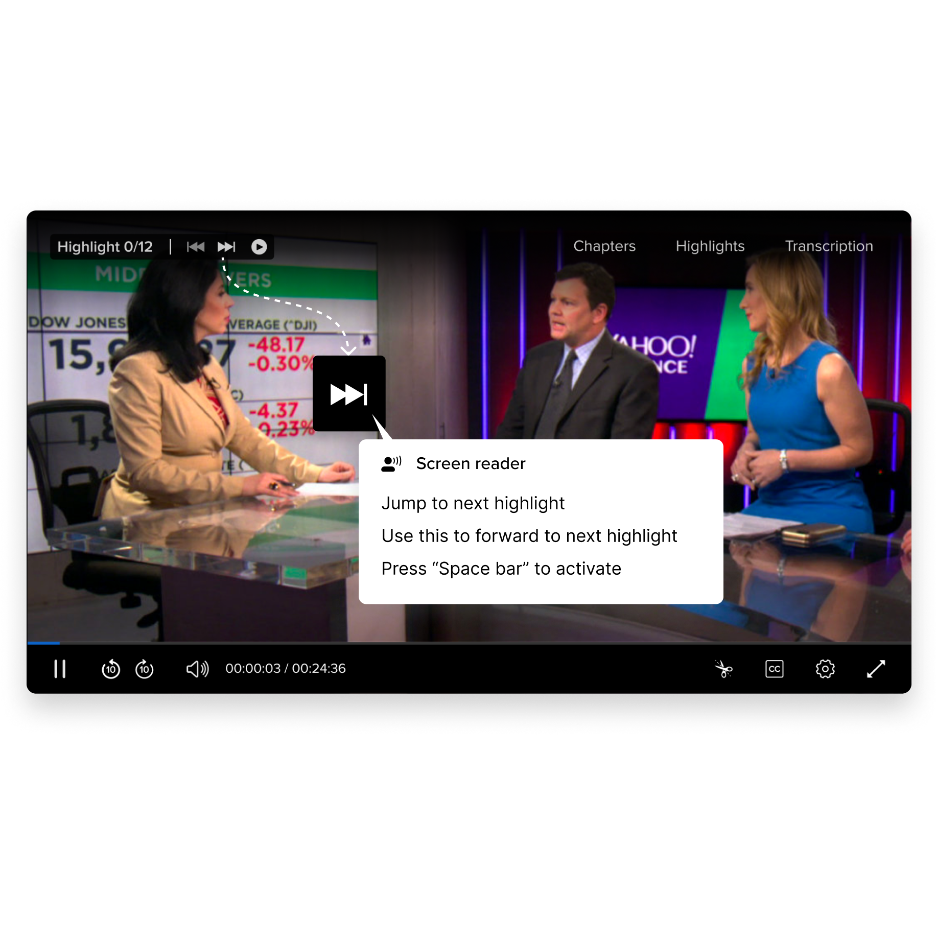
We've ensured compatibility with screen readers, providing clear alt text for images/videos and concise ARIA labels for every designed component, so that individuals with visual impairments can perceive and interact with our design effortlessly.
