Designing a unified communication powerhouse
Brief
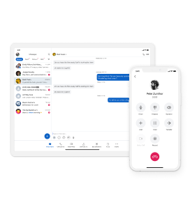
As remote and hybrid work gain traction, Verizon planned a UCaaS offering (United Communication As A Service) tailored for SMBs (Small and Medium-sized Businesses). Our challenge was to design a user-friendly cross platform application that seamlessly utilised Verizon's strengths in video conferencing and telephony, while introducing features like messaging and audio-video calling.
Product Strategy
User Experience Design
User Interface Design
Telecommunications
Research & Strategy
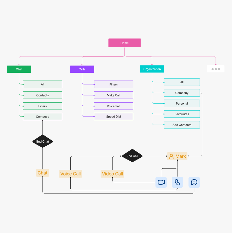
Through research we developed an understanding of the baseline features and experience that users expected, as well as gaps where we could add value. Our strategy involved creating personas and user journey maps based on the findings from our user interviews. We also developed an information architecture that aligned with the user’s mental model.
We looked at other UCaaS products in the market across messaging, calling and video capabilities. Studying their features and overall UX helped us make informed decisions during the design process.
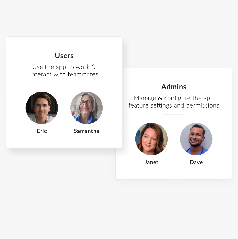
We identified 4-5 personas across both roles– Users and Administrators. Uncovering their goals and pain points helped give direction to the MVP (minimum Viable Product) solution and product roadmap.
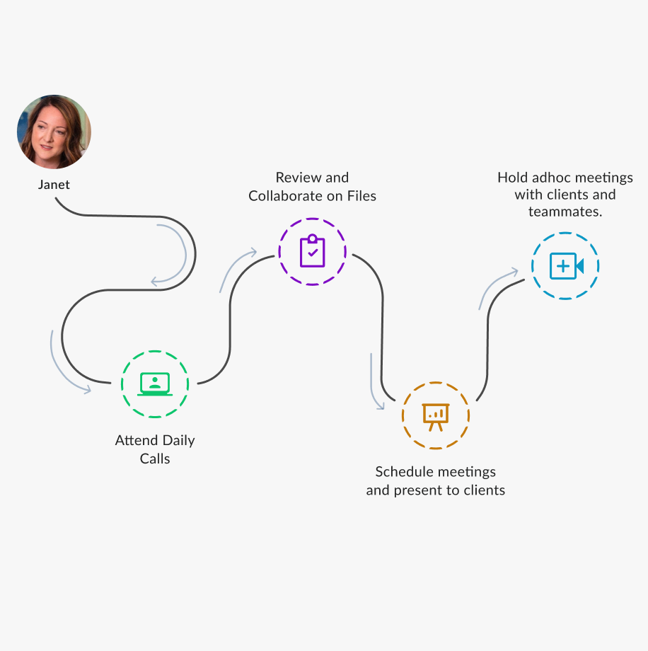
The user journey and empathy maps of these personas led us to understand their needs from the product in greater detail.
A well-defined IA ensured that the navigation on mobile devices was logical and intuitive to the user’s tasks.
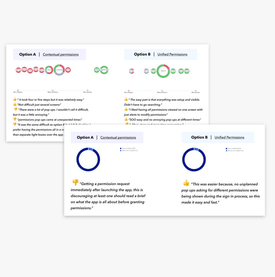
The designs were tested internally & externally to validate design decisions and make further improvements.
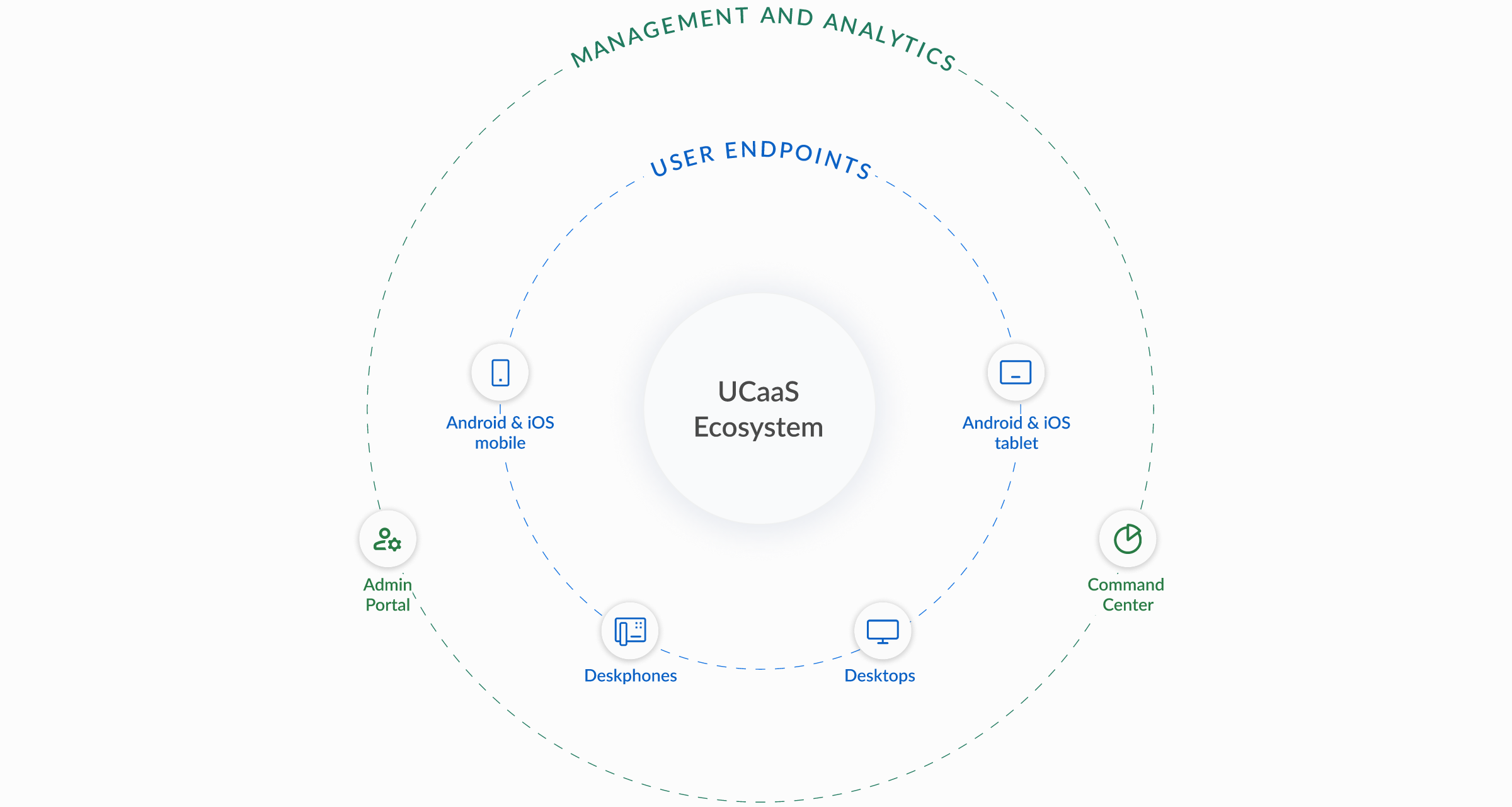
Unified, cross-platform design with robust management and analytics
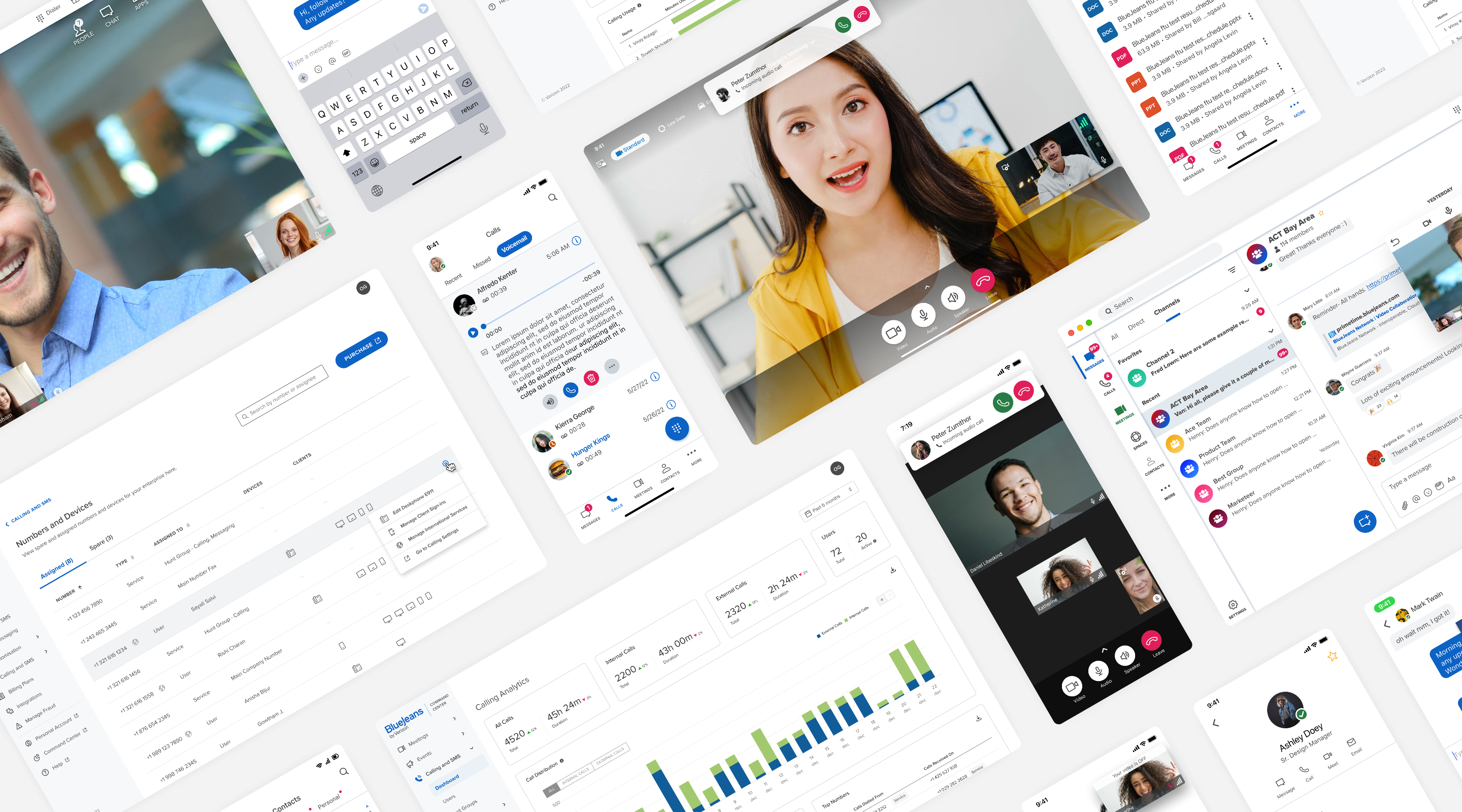
The UCaaS (United Communication As A Service) solution required designing an experience that transcends platforms, featuring user-friendly portals for effortless management and intuitive analytics for powerful insights.
Powering communication at workplaces
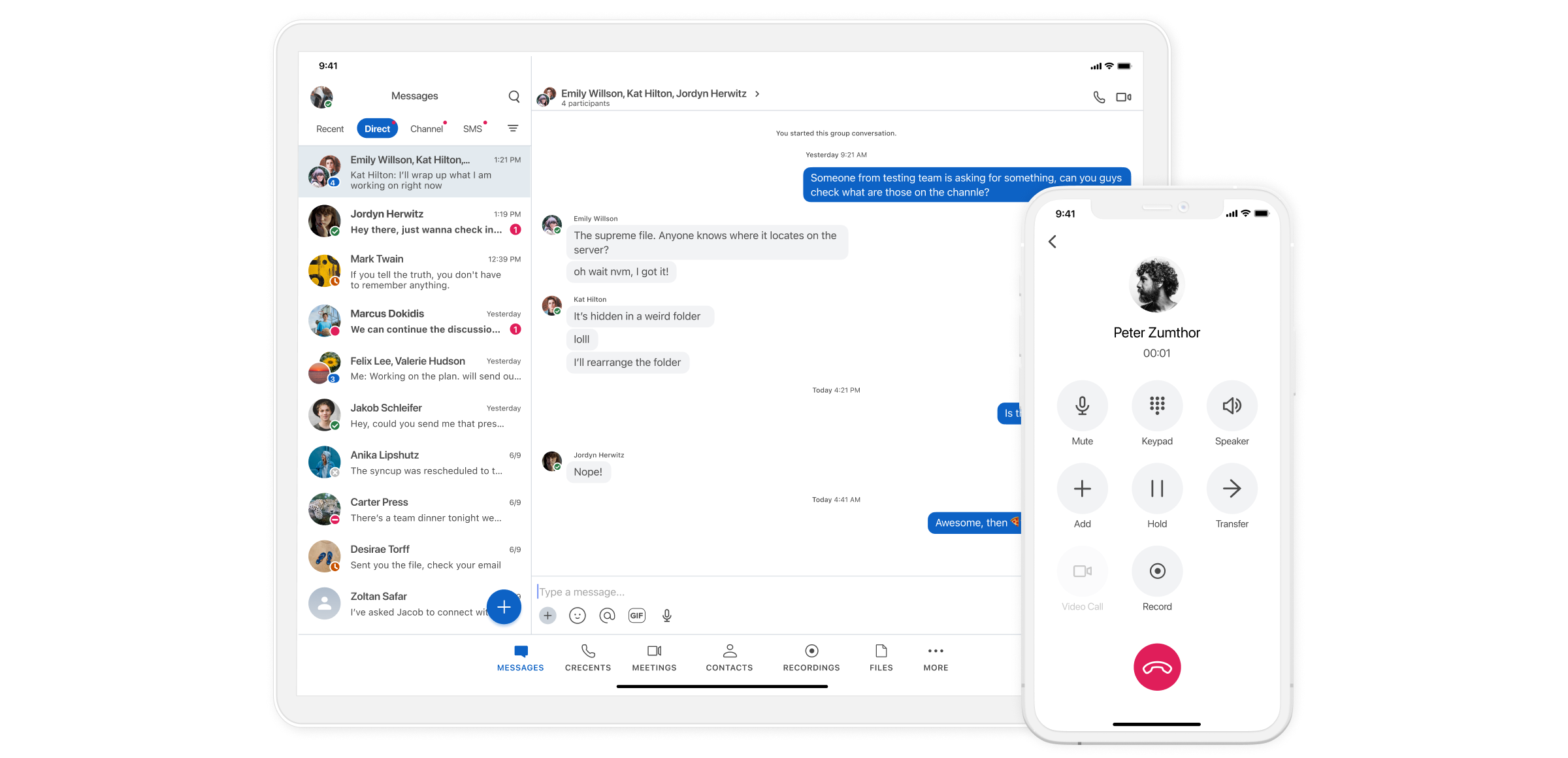
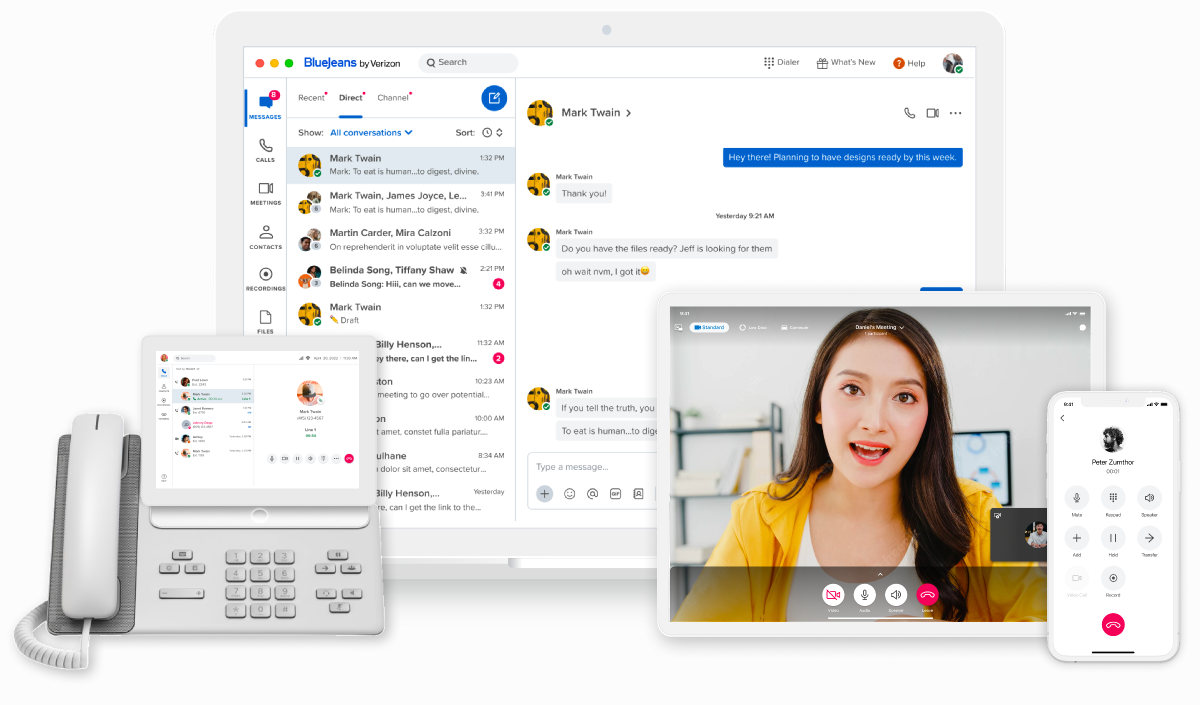
The UCaaS solution lets businesses and teams stay connected easily, whether they are in the same place or far apart. It combines various communication methods like phone & video calls, messaging and meetings. It also offers other features such as file sharing, company contacts and contact status in a single platform.
Designed for multitasking
As the app focuses on work-related communication and collaboration, it was crucial to make multitasking easy. Our designs took into account common scenarios and edge-cases, such that users can seamlessly manage video calls, audio calls and chat messages.
Streamlined onboarding for minimal drop-offs and accelerated setup
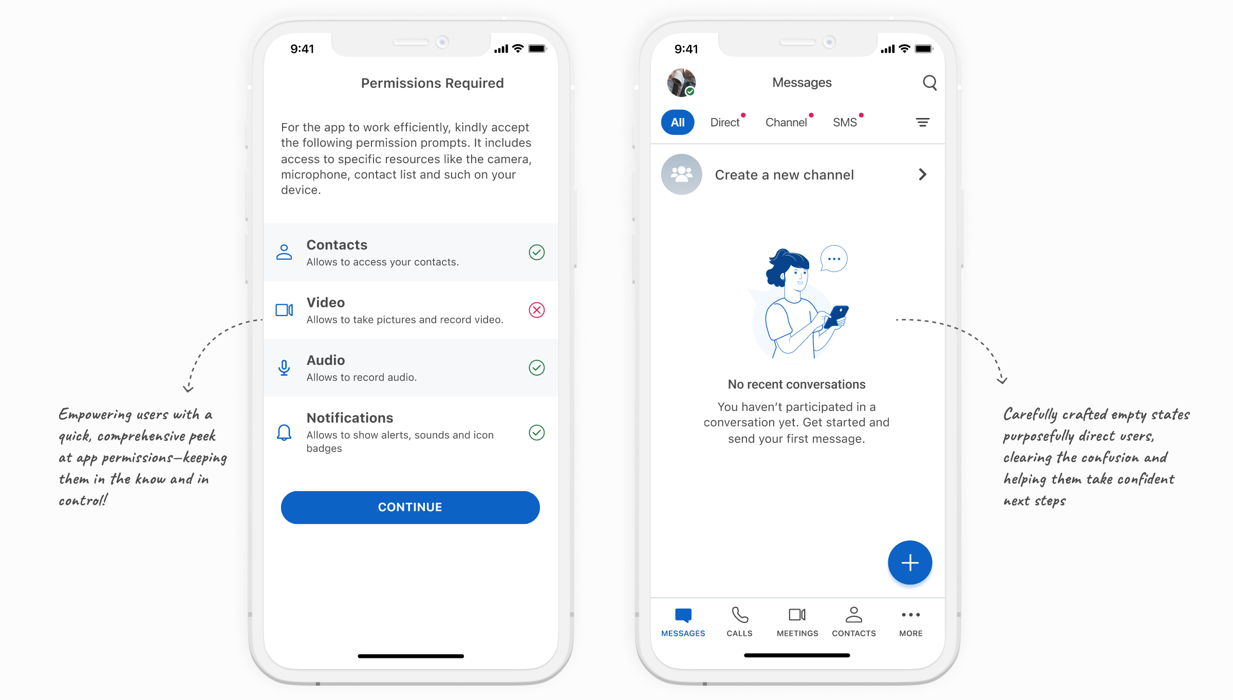
The app is intended for use by Small and Medium-sized Businesses. Recognising that users may lack the expertise or time for intricate configurations and steep learning curves, it was crucial for the app's design to prioritise intuitiveness and user-friendliness. We worked on an onboarding process for new users which guided them to grant essential device permissions for calls, camera, and contacts – all of which are vital for the app’s functionality.
Universal design patterns for consistency across devices
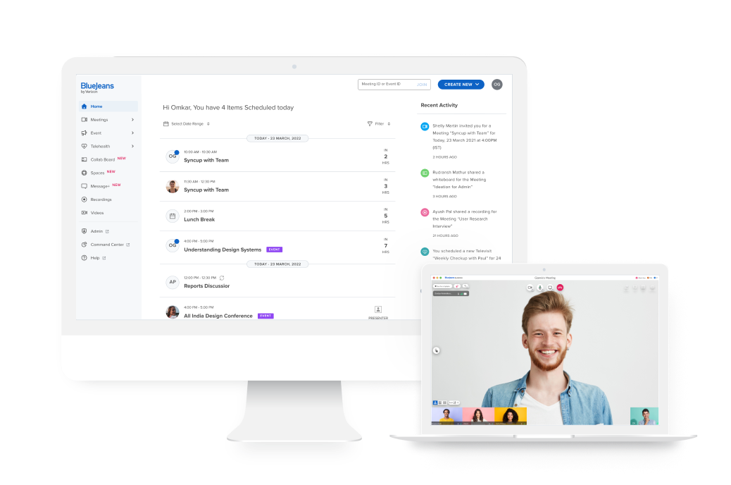
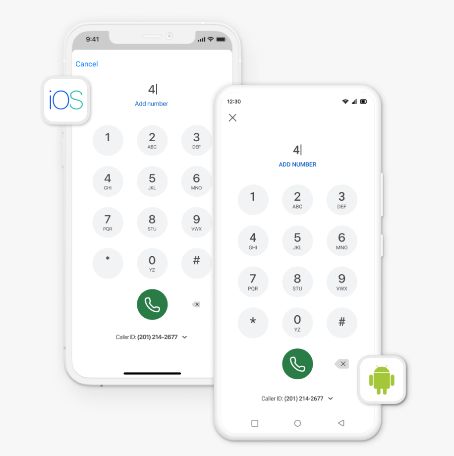
The app's design takes into account our multi-device reality, as users access the work-related communication tool across various devices (web, tablet, and mobile). Our design approach prioritized maintaining a consistent experience across all platforms.
A consistent design system was followed across all devices. We made minor changes to tailor the app to each operating system, such that it aligns with the interaction patterns familiar to users of those platforms.
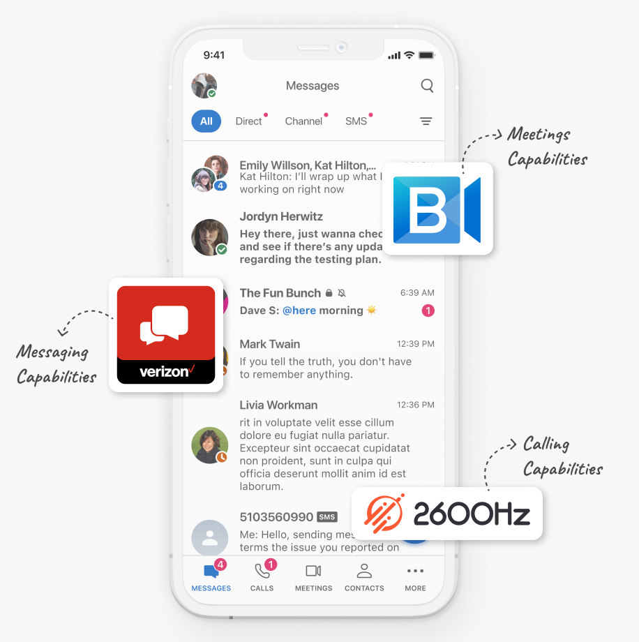
The app leveraged 3rd party tools for messaging and calling capabilities. This posed a design challenge in ensuring a consistent user-experience despite the different interaction flows and patterns of the underlying systems.
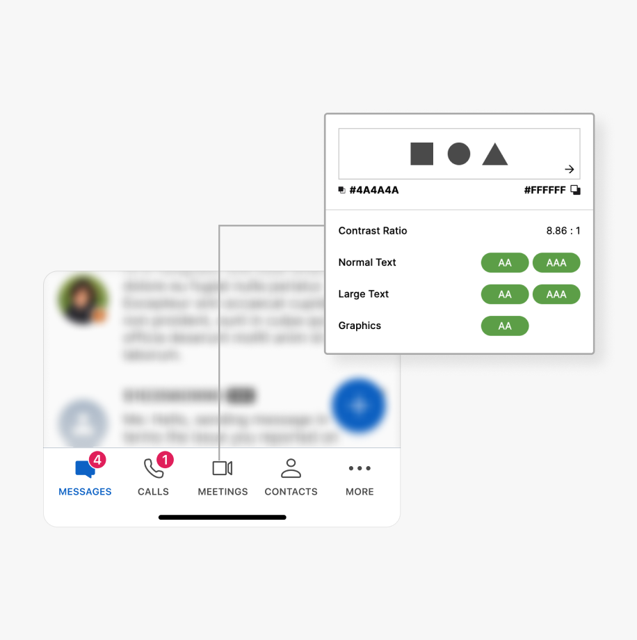
We ensured the mobile app's adherence to accessibility standards, guaranteeing an inclusive and user-friendly experience for all users. Design considerations included sufficient color contrast, legible text that follows device defaults, intuitive navigation and compatibility with screen readers.
Optimising end user experience by enabling granular control for admins
We developed an easy-to-use admin portal from which administrators can tailor the app according to their organization's requirements. Our design prioritized intuitive presets and workflows, user-friendly terminology, and high control over access at enterprise and user-level. We tackled the additional challenge of ensuring a consistent user-experience throughout the portal, while integrating third-party tools and their capabilities.
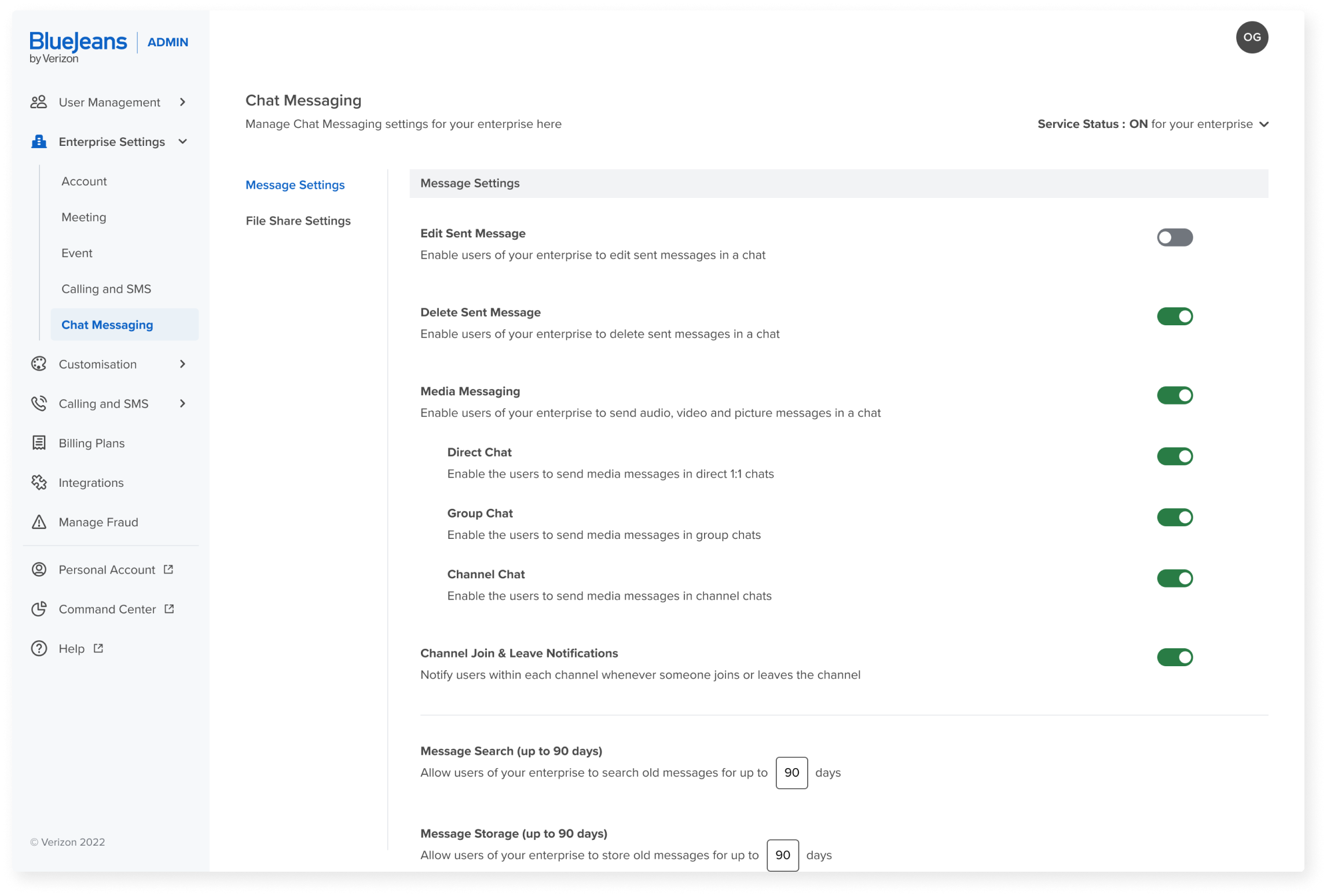
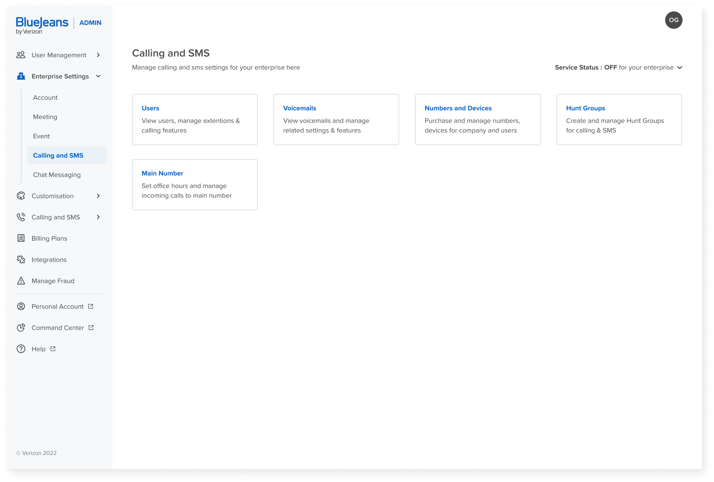
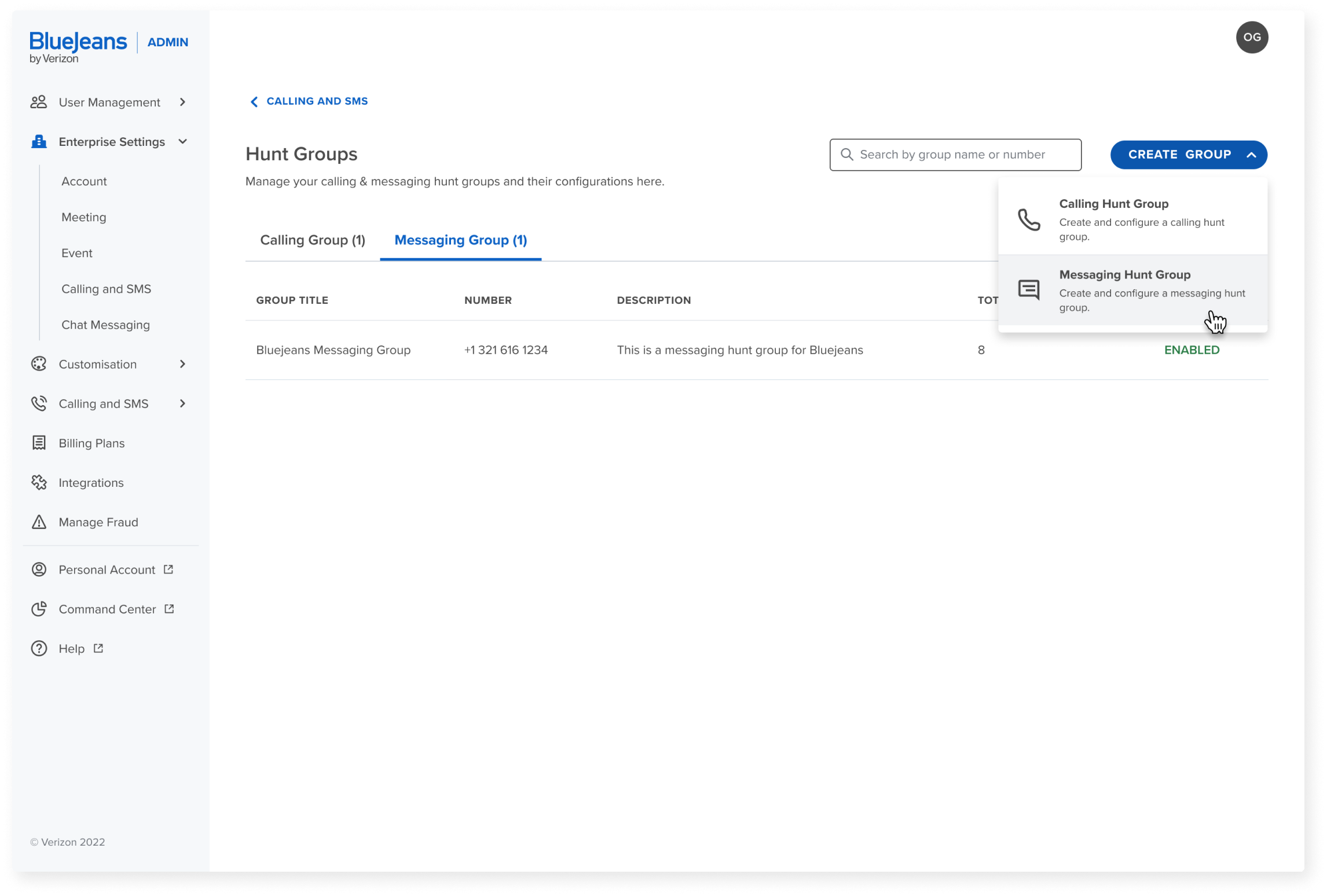

Curate the end-application to meet the requirements of your organisation as per different levels of access control. The granular management of settings through the admin portal enables the seamless implementation of a tailored user experience on the end-application, aligning precisely with your organisation’s requirements.
Analytics for deeper understanding of product usage
Through analytics, the 'Command Center' module offers administrators valuable insights into app usage, allowing them to gauge both app engagement and team collaboration. We ensured that the relevant data was presented meaningfully such that it can aid administrators in their planning and optimization efforts.
