Creating a platform for an innovative voucher and rewards portal
Intro
Gainon is a rewards and gifting program for young adults and digital-savvy consumers. We helped them revitalise the online gifting market by bridging the most challenging gap between online and offline experiences - by humanising the process and making digital experiences more thrilling, enjoyable, and life-like.
Product Strategy
Innovation Consulting
UX Design
eCommerce
https://gainon.in/
A fun, youthful and exciting approach
The world of online rewards and gifting is vast and varied. For the platform to stand out, we made the user experience more realistic and thrilling by adding elements of surprise and human interaction.
Gainon’s Offering - Mystery Box
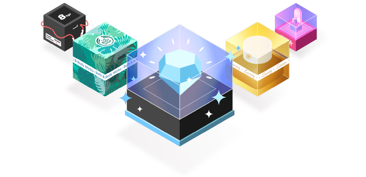
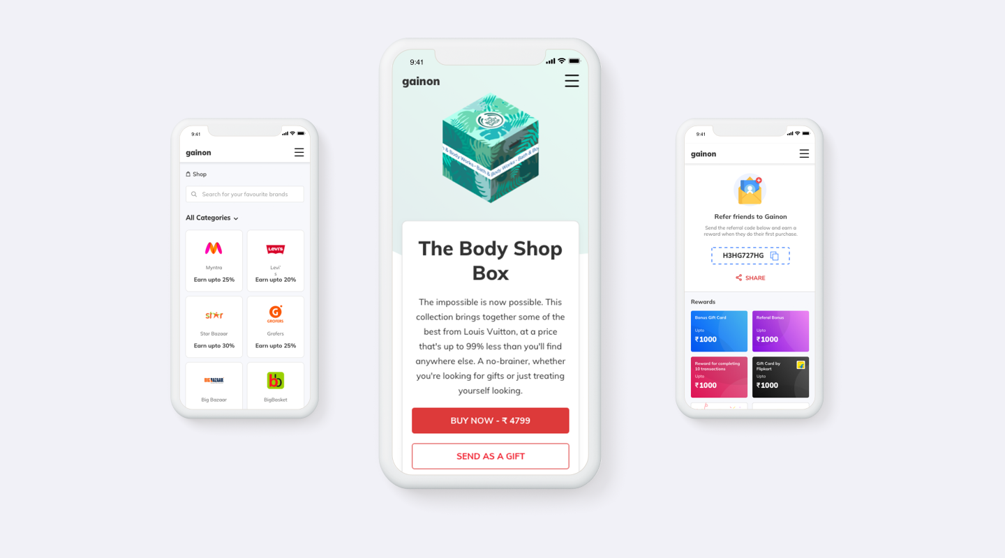
The first offering we worked on was Gainon’s Mystery Box. We replaced the age-old system of sending digital vouchers, and instead created a digital experience of ‘unboxing’ that incorporated elements from real-life actions. Moreover, we added a layer of gamification to make the platform interactive and create an experience that would spark the feeling of anticipation amongst users.
Creating a thrilling box selection process
We used bold colours, eye–catching illustrations, and micro-interactions to make the journey of picking a box very user–friendly and compelling. The box’s contents are unknown to the user, thus we created visuals and an experience that would rouse curiosity, excitement, and hope. It was imperative that the user looked forward to purchasing a box so that they would be keen to repeat this experience again.
Creating unique custom illustrations
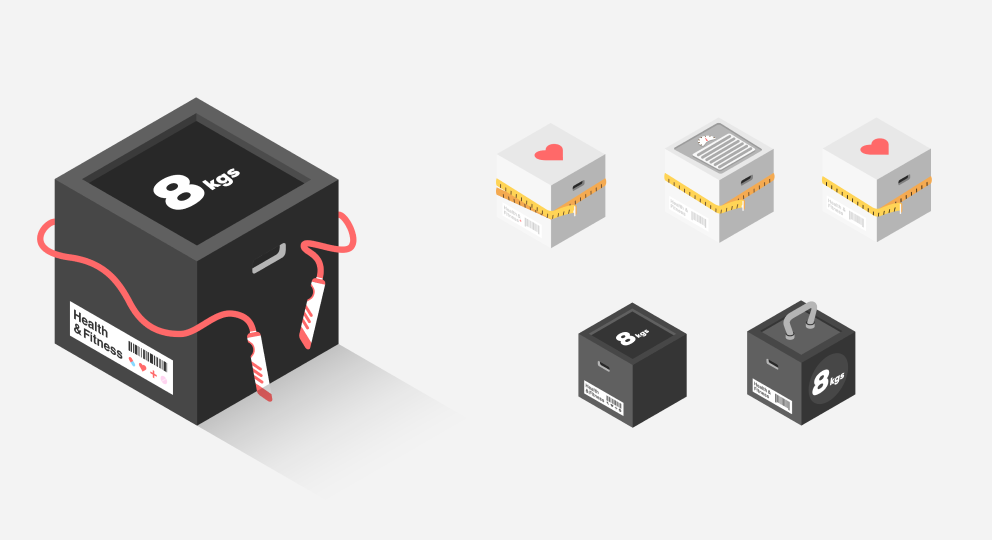
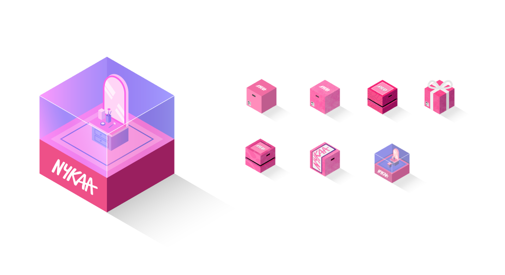
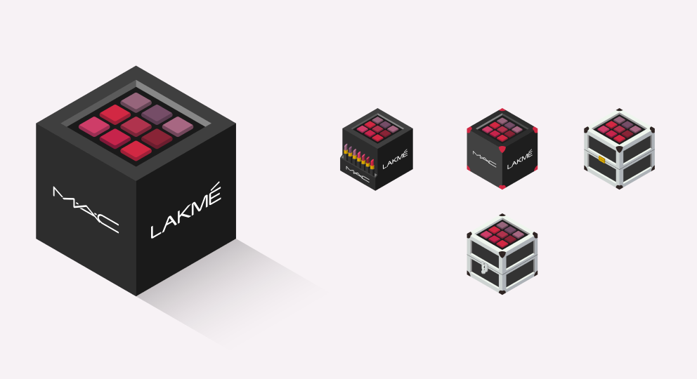
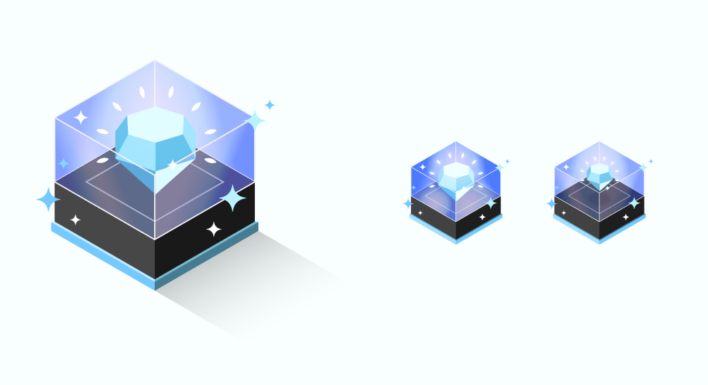
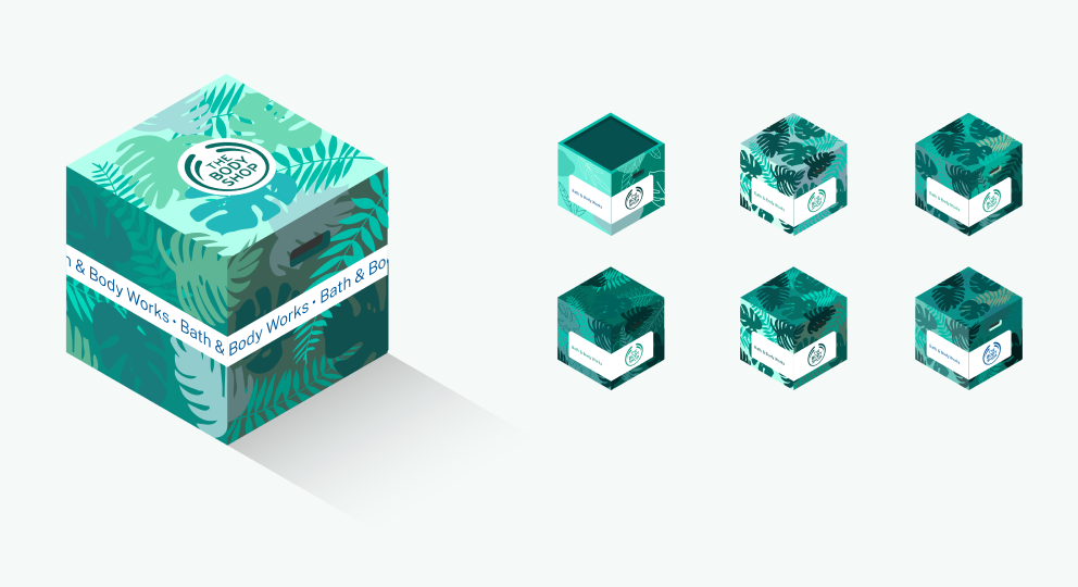
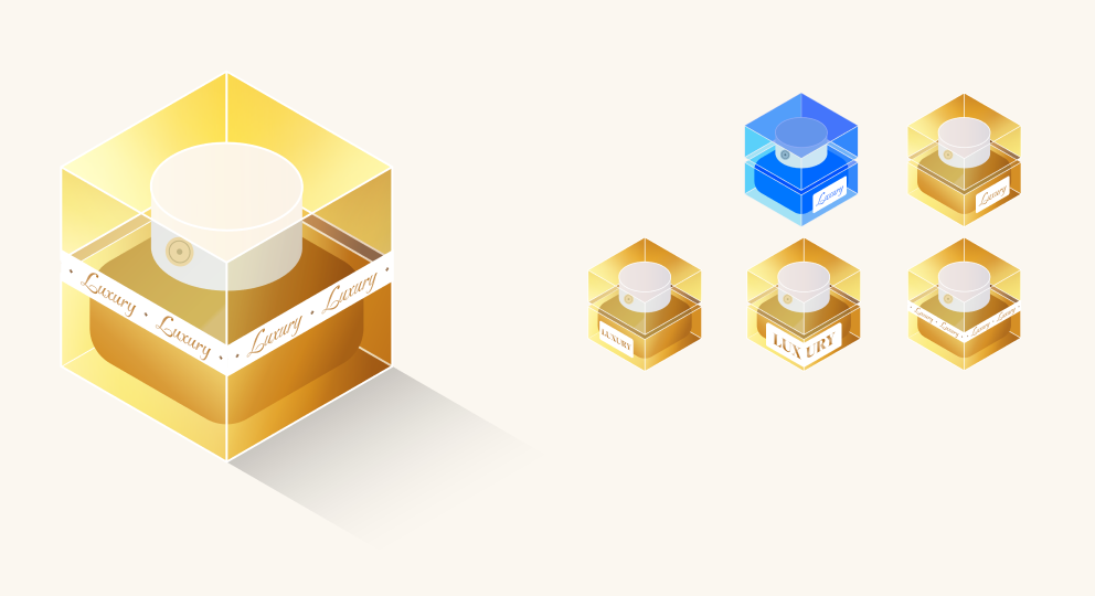
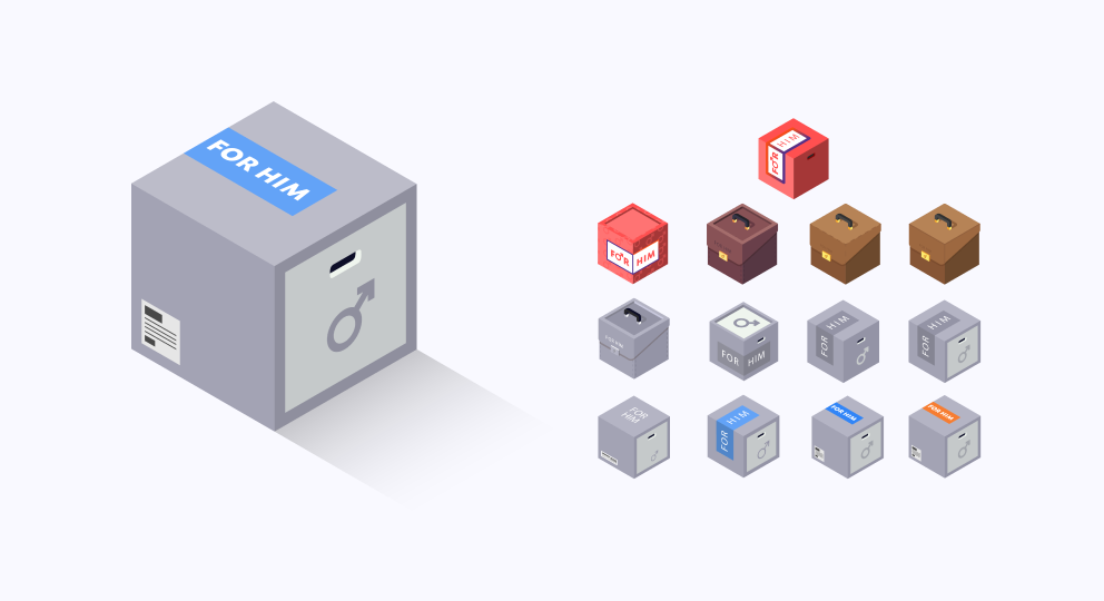
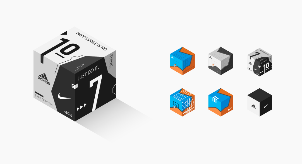
We designed each Mystery Box carefully and thoughtfully to reflect the platform, seller, and product category. We used brand-specific colours, illustrations, and animations; thus each box was a reflection of the parent brand and at the same time retained a unique identity, all aimed toward appealing to a discerning, digitally savvy consumer.
We crafted multiple iterations for each Mystery Box, playing with colours, typefaces, and illustrative elements to create unique personas for each brand and product category. It was important for each box to stand out, yet be indicative of a specific category and parent brand.


The Experience of Unboxing
After a consumer picks their Mystery Box, our task was to ensure that the unboxing experience was just as eventful. We wanted the consumer to feel excited and intrigued, especially since they don’t know what they’re getting. We incorporated lots of elaborate tactile animations, human actions, and captivating visuals that would digitally recreate the experience of receiving or sending a gift. For instance, when a user wants to open a box, they pull down and the screen is covered with confetti!
Creating a responsive, adaptive design
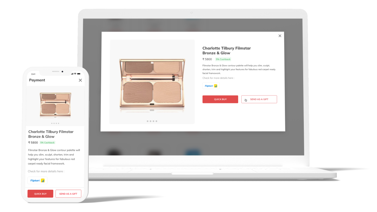
Gainon’s design was created keeping young adults and millennials in mind; an audience that is familiar with the gifting marketplace and wants something more interactive than a paper voucher. We created a responsive website that was easily accessible across devices and capable of adapting to different screen sizes.
Gainon’s Offering - Vouchers
The second offering we worked on was Gainon’s marketplace for vouchers from leading sellers, brands, and platforms. With a digital savvy, millennial user in mind, we designed a website that was efficient, easy to use and fast to load.
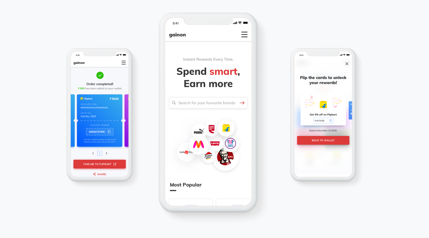
Making coupon redemption a breeze
The modern consumer is rather impatient. Users are quick to drop off unless a website is quick, well structured and saves time. For Gainon, thus, we designed a website that helped users to redeem their coupons faster by crunching the redemption process down to 3 brief steps.

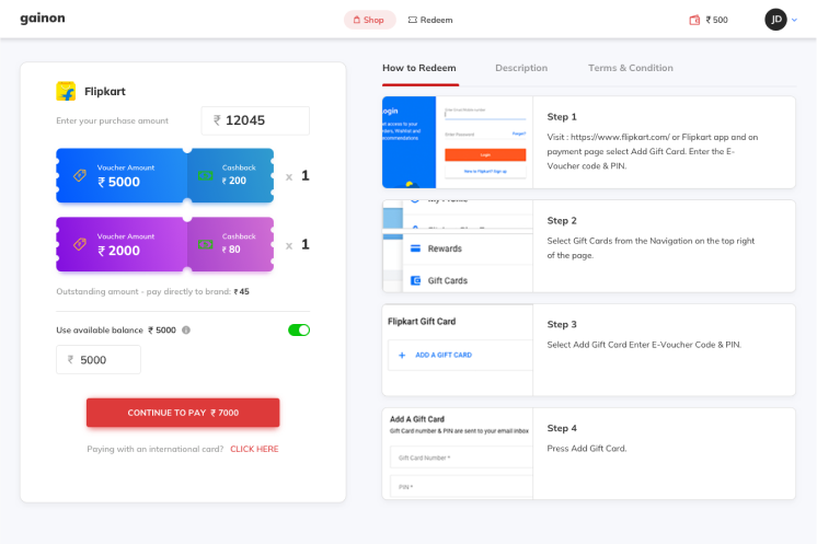
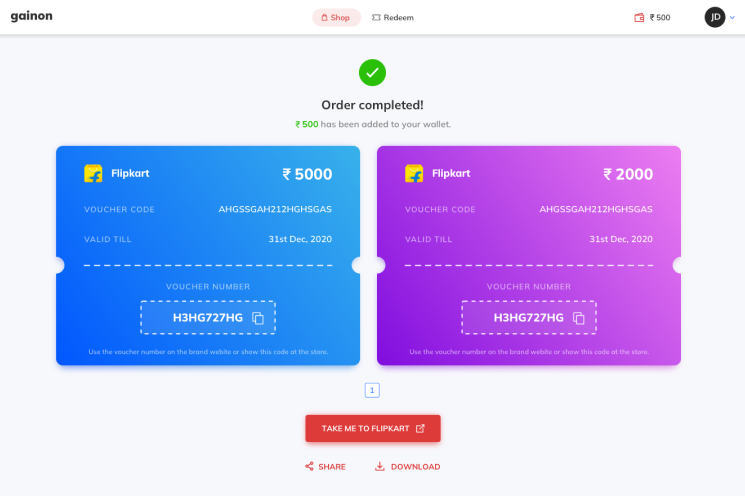
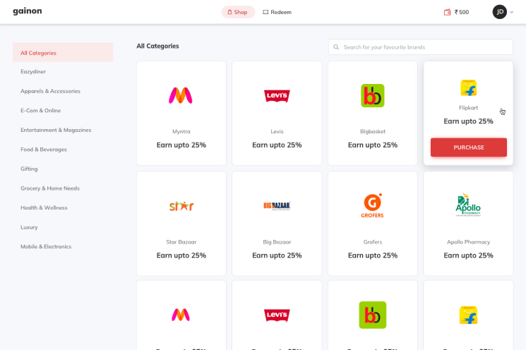


A new-age interactive rewards interface
We recreated the real-life experience of using vouchers in the digital space to make the process more exciting and visually appealing. We designed interactions, colours and animations that would humanise the redemption process in order to make it one that fills users with anticipation and joy.
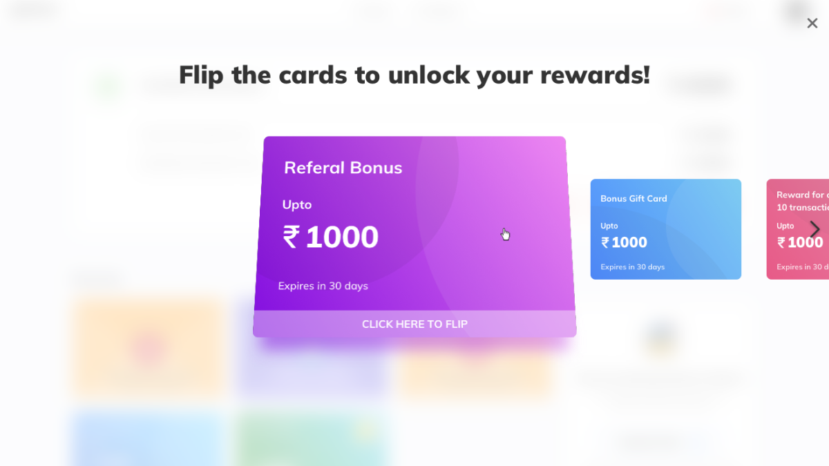
More interactions, greater impact
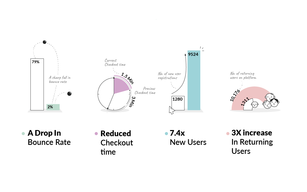
By creating a life-like, enthralling experience for Gainon’s platform, users connected with the product much more. The numbers are proof. NOCT’s redesign of Gainon’s website had a massive impact on the user journey, the time spent by users on the platform and the total number of users, amongst other figures.
