Designing the future of virtual events
Brief
“Bluejeans Events” is Verizon’s virtual events platform trusted by industry giants like IBM, Redhat etc. We've completely reimagined the product, making it sleek, user-friendly, and loaded with incentives to drive unprecedented attendee engagement.
User Research
Accessibility Audit
User experience & Interface
Innovation Consulting
Cloud Video Conferencing
Research and Discovery
We did thorough research by conducting user interviews, conducting an accessibility audit, a heuristic evaluation, and a competitor analysis.
A brand new experience with a modern look & greater consistency
Designing for inclusivity: ensuring people with disabilities can use the product easily
Incorporating insights gathered from the Accessibility Audit, we executed a redesign process guided by strict adherence to WCAG accessibility guidelines.
Amping up attendee engagement through a delightful reactions feature
We introduced the reactions feature, to encourage attendees to interact more during the event, while event organisers and speakers can see the reaction analytics in real time.
Enabling attendees to go live in the event with Raise hand feature
Attendees are usually in a listen only role in the event, i.e they can’t share their audio / video. This can be an issue in scenarios where the attendees would like to interact with the presenters in a live Q&A.
With the Raise hand feature, the attendees can request to participate. Once the organisers accept this request, the attendees will be promoted as presenters, which enables them to share their audio / video in the event
Improved attendee engagement in event surveys and polls
Polls in online events help people get involved by asking them questions in real-time. This makes the event more interesting and keeps everyone paying attention. It also lets organizers learn what people like and want. By using polls smartly, organizers can make the event more fun, personalize it, and keep the energy up, making everyone happier with the experience.
Enhancing public chat's allure: revamping event chat for better engagement
We also improved the event chat with subtle animations and attention to detail like adjusting the roundness of the chat blurbs to show grouping of multiple messages sent by user within a duration of 1 minute.
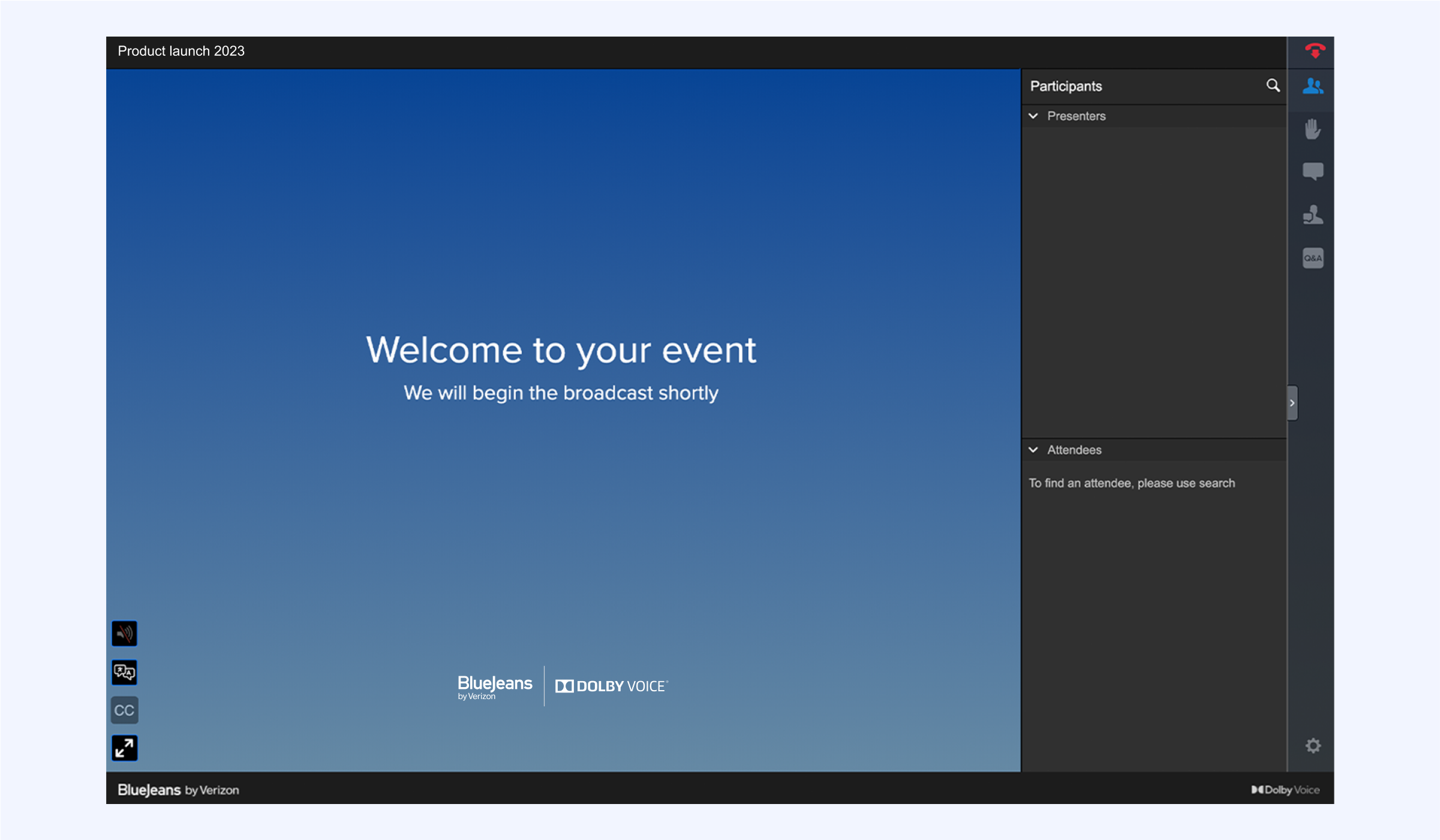
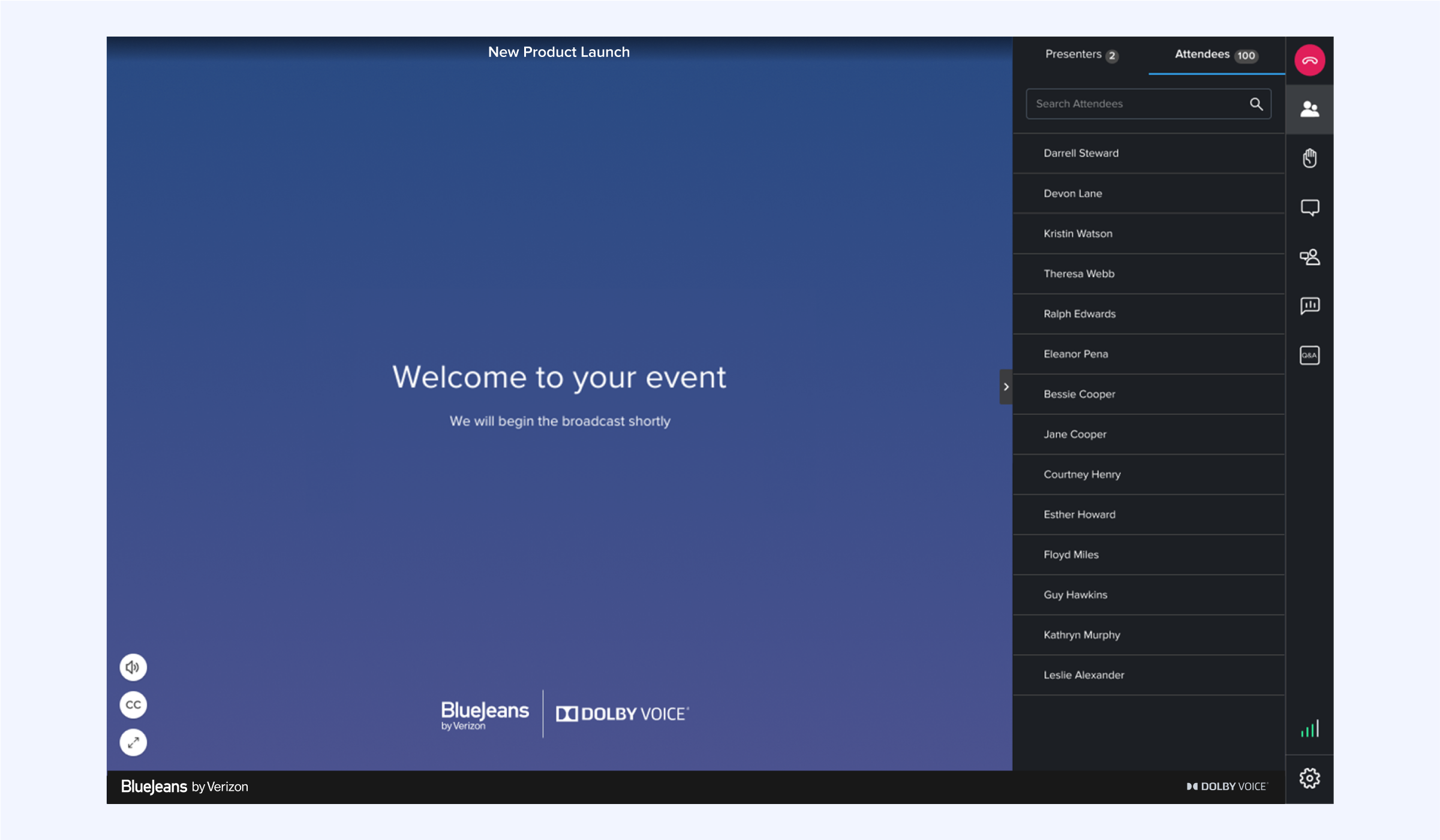
Simplified event joining experience
We have refined the layout to align seamlessly with the natural reading order, enhancing the information absorption. The secondary joining methods have been organised in a dropdown menu, creating a smoother user experience, for regular users.
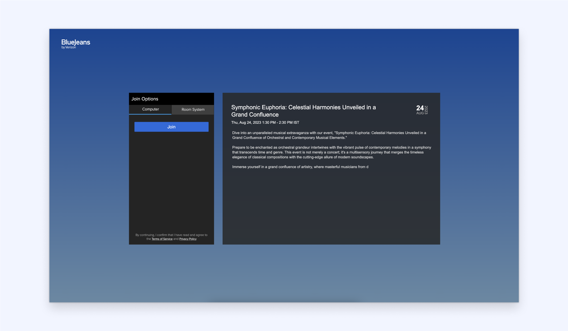
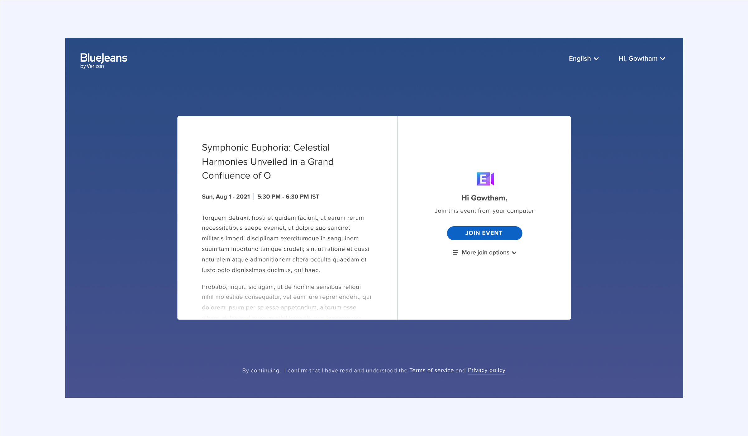
Considering all edge cases
We found from research, that not all event organisers have detailed descriptions and the event title can vary from as small as 4 letters up to 200+ characters. We optimised the login screen UI for all possible characters counts of event title and the description.
Adding delight with Seamless interactions
We designed smooth transitions between different states of user interaction to make the experience smoother
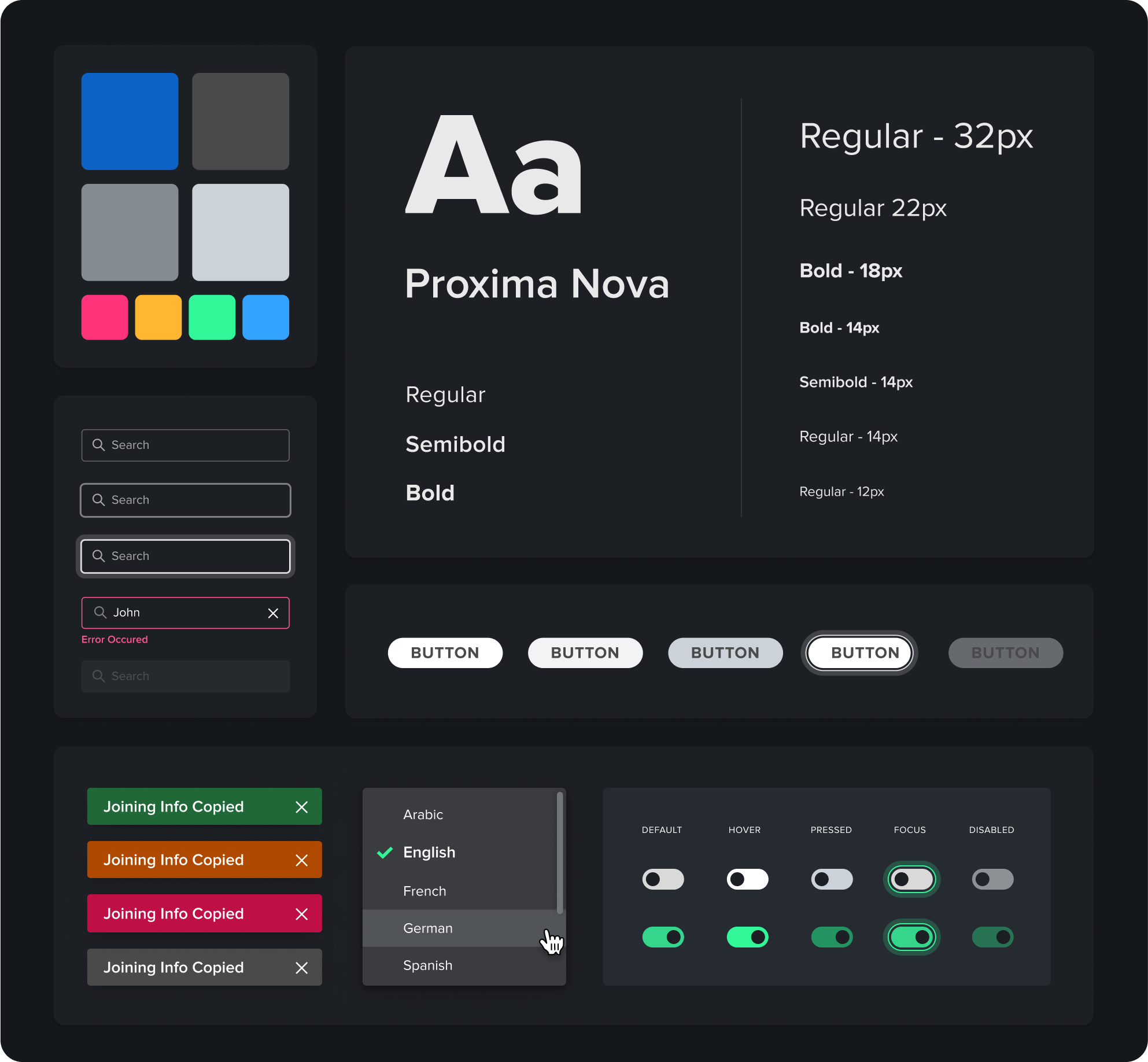
Creating a design system for consistency
We delivered a comprehensive and exclusive design system that is unique to Verizon events, enabling the essence of the brand to seep through every screen that gets designed for it, now and in the future. Covering button interactions, text capitalisation rules, tone of voice, micro-interactions and everything in between, this system serves as an elaborate and foolproof instruction manual for designers who may work on this product in the future. It also ensures no developer misses out on the minute design details that bring delight to users!
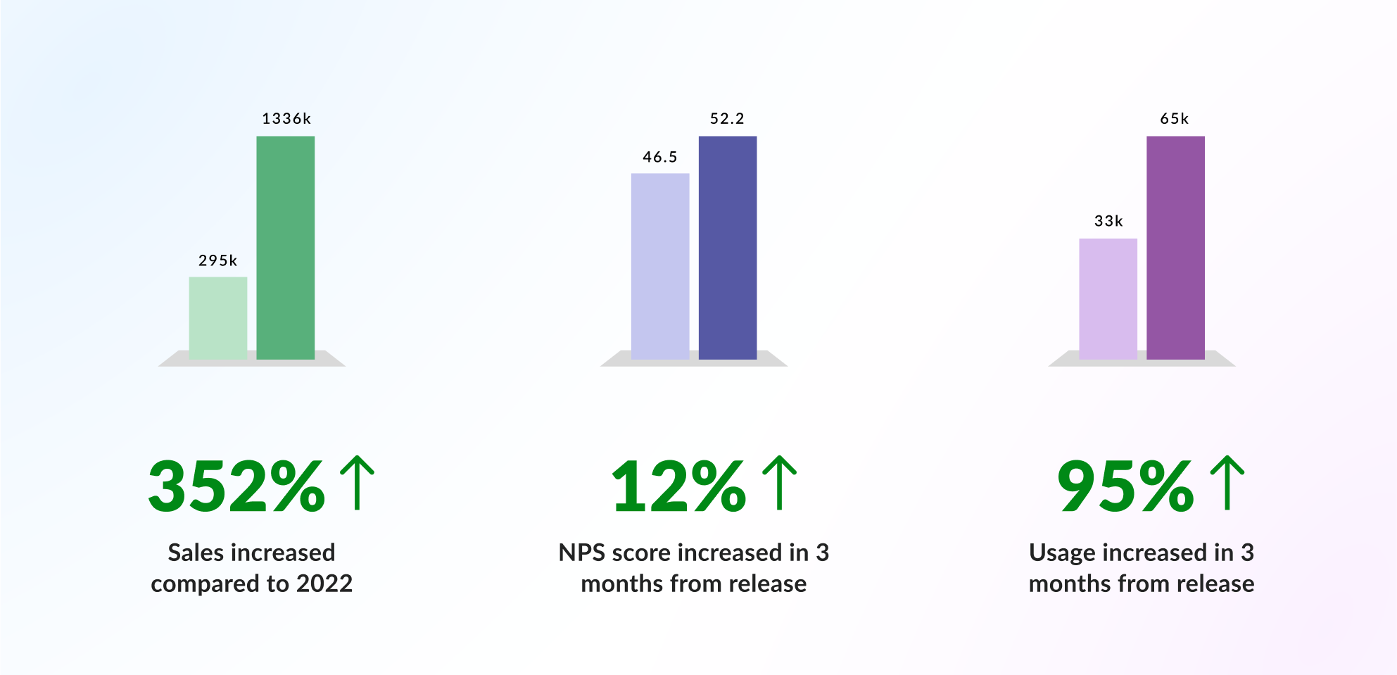
Improved usability - High impact
By creating a more accessible and immersive experience, users connected with the product much more. The numbers are proof. NOCT’s redesign of Verizon’s Virtual Events product had a massive impact on the Sales, NPS score calculated from user feedback and Overall usage amongst other figures.